

APIs & Features
After successfully setting up the SDK, you can now create a new instance of the card service and handle real customer data.
Listening to events
For tracking purposes, you can use the following code snippet to configure an event listener on your project.

 Switch Theme
 Expand More
 Copy
Copy
|
|
 Code Copied
 To check SDK setup success
Use the following code snippet to check if your SDK setup was successful or not.
Switch Theme
Expand More
Copy
|
|
Code Copied To log your users out
To logout your users from your application, use the following code snippet in your project:
Switch Theme
Expand More
Copy
|
|
Code Copied Features
This section covers the various functionalities of the react native card SDK.
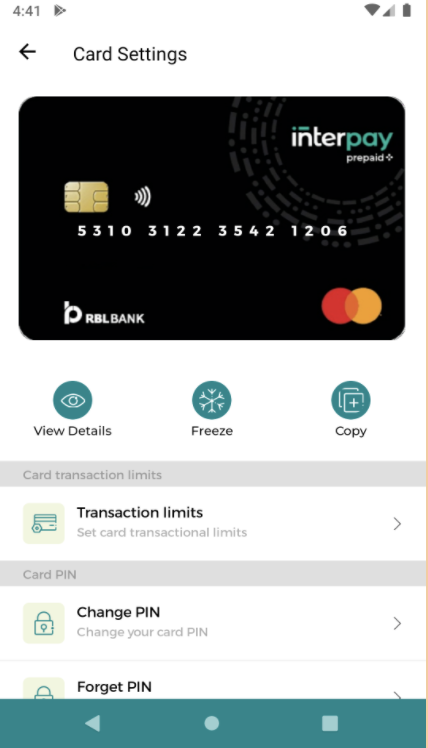
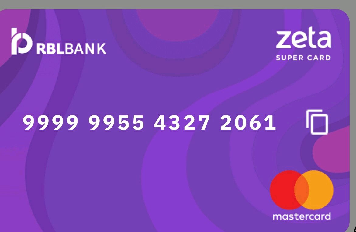
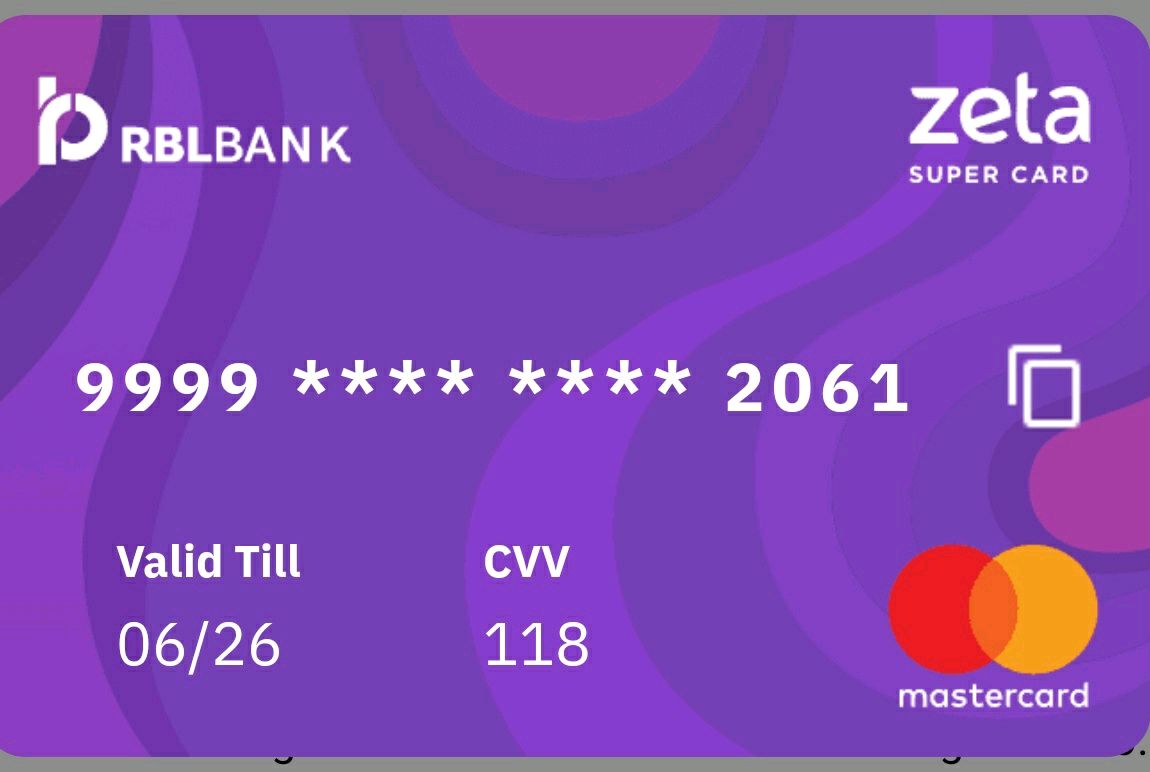
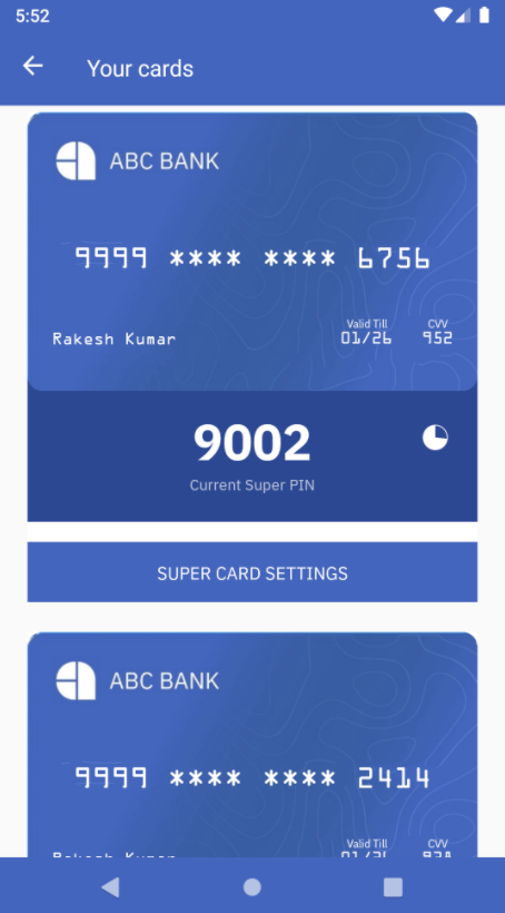
Get card view UI
The default view of the card is the collapsed view which displays only the PAN upfront. On clicking the card, users can toggle between the default view and the sensitive data view which requires their authentication. You can also integrate the copy feature along with the card view which allows users to copy the card number to the clipboard.
Switch Theme
Expand More
Copy
|
|
Code Copied Properties supported
- cardId - (String) Compulsory property. This denotes the card ID for which the card view is required. For example: CARD_ID = “123456789”
- templateId - (String) Optional property. This denotes the template ID you want to render. For example: TEMPLATE_ID = “card_EN_UIVIEW”.
- jsonPayload - (Object) Optional property. This denotes the additional payload you want to send. For example: JSON_PAYLOAD = { name: ‘user_name’, company: ‘zeta’ }.
Sample Screens
Collapsed view
Sensitive data view
Copy Card number
Card SDK provides the functionality to copy the un-masked card number. On success, it shows a toast message with the card number. Post that, you can paste the card number where-ever required.
Here is the code snippet for the same.
Switch Theme
Expand More
Copy
|
|
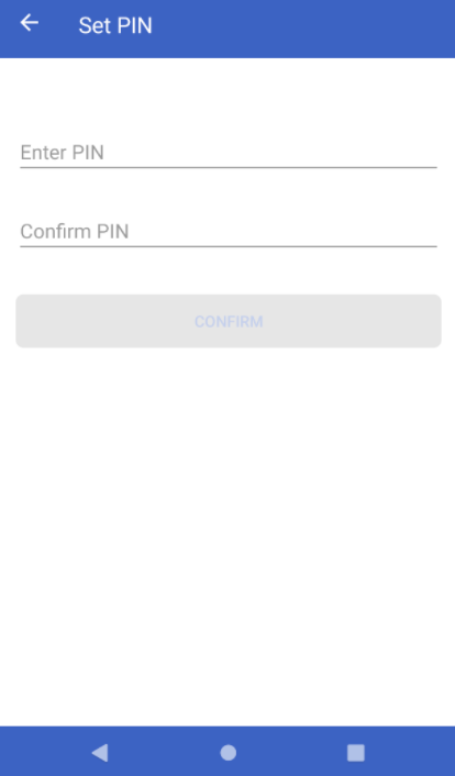
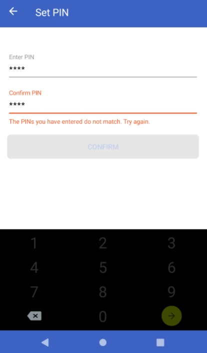
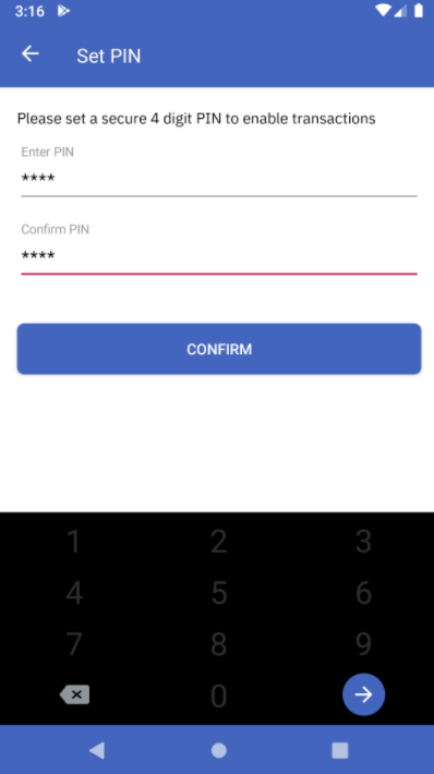
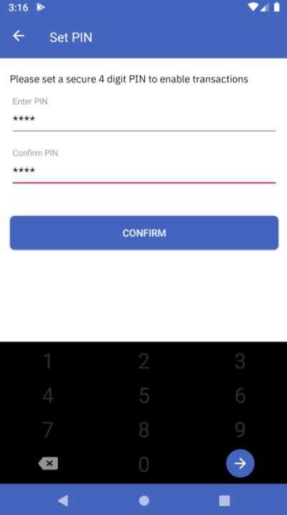
Code Copied Set Static PIN UI
The SDK provides a user interface for setting the static PIN. Users are asked to enter the static PIN twice while setting up and a set of validations such as PIN length are determined at this stage. After confirmation, this static PIN is stored in the encrypted vault.
The following code snippet will allow you to configure the UI for setting up the static PIN
Switch Theme
Expand More
Copy
|
|
Code Copied Sample response
- Set Static PIN UI - Initial
- Set Static PIN UI - Incorrect PIN
- Set Static PIN UI - Correct PIN
- Set Static PIN UI - Success
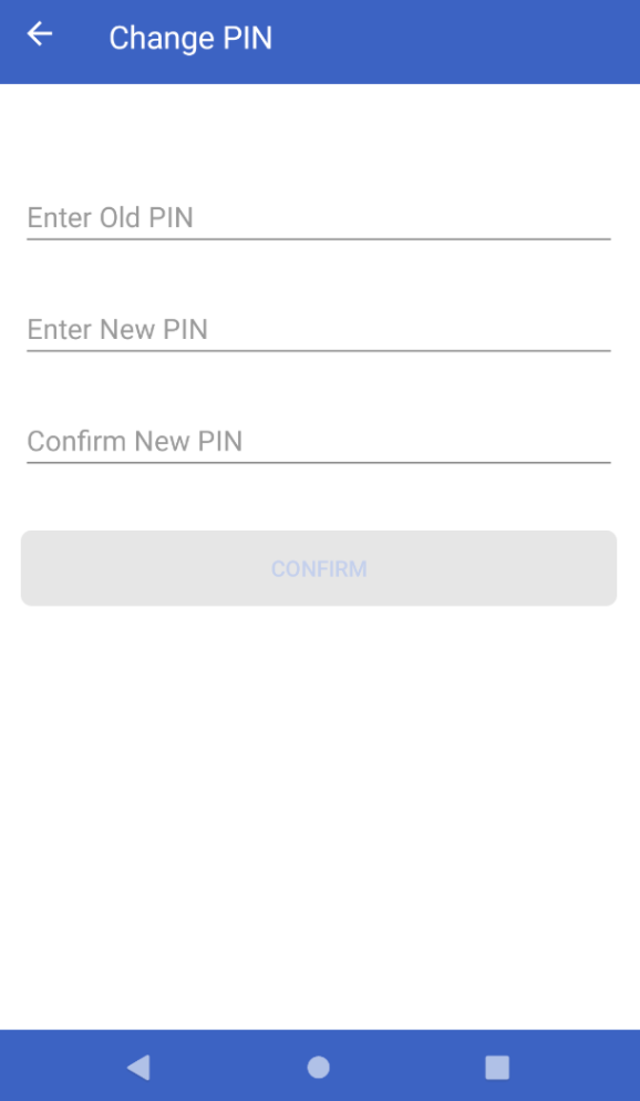
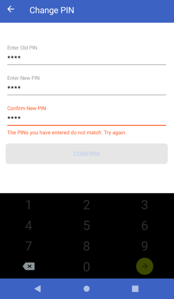
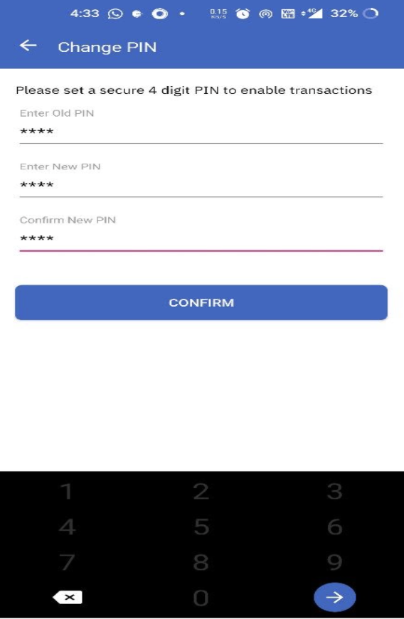
Change Static PIN UI
Modifying an already existing static PIN can also be configured via this SDK. The static PIN authentication is closely coupled with the user authentication and it’s necessary for the users to enter their PIN during every app launch activity. The UI comprises three input fields where we can enter:
- Old Static PIN
- New Static PIN
- Re-enter New Static PIN
The user interface does the following validations:
- PIN lengths
- Correctness of Old Static PIN entered
- Equality of the New Static PIN entered twice
The following code snippet will allow you to modify the static PIN on the app.
Switch Theme
Expand More
Copy
|
|
Code Copied Sample response
- Change Static PIN UI - Initial
- Change Static PIN UI - New PIN Mismatch
- Change Static PIN UI - Success
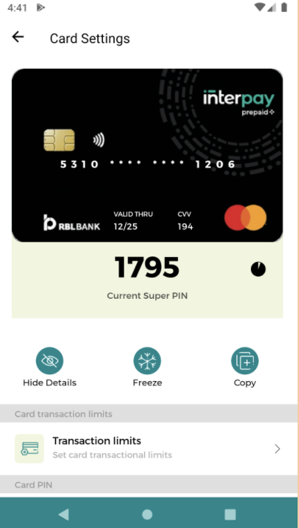
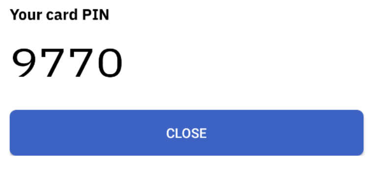
Super PIN
Super PIN is a time-synced dynamic pin that changes every 2 minutes (configurable via backend logic). The app can query for the Super PIN with respect to different resources associated. User’s authentication is required to fetch the Super PIN.
Super PIN for resource
The return value is a Super PIN along with its validity in milliseconds. The following code snippet will allow you to fetch the super PIN for a selected resource.
Get Super PIN UI
Note: Use this only when you are sure that users have a single resource associated with their accountHolderId’s
Cards SDK also provides a UI for fetching the Super PIN. The UI adds a translucent black background on the existing screen and shows a popup containing the Super PIN. The UI is in accordance with the theme with which the SDK has been configured.
Here is a code snippet on how you can fetch the Super PIN UI assuming a single resource
Switch Theme
Expand More
Copy
|
|
Code Copied Sample response
Get Super PIN API
The return value is a super PIN along with its validity in milliseconds. You can use this API when you’re sure that users have a single resource associated with their account holder ID. The following code snippet will allow you to fetch the super PIN.
Switch Theme
Expand More
Copy
|
|
Code Copied Super PIN UI for resource
Cards SDK also provides a UI for fetching the Super PIN for a selected resource. The UI adds a translucent black background on the existing screen and shows a popup containing the Super PIN. The UI theme and layout would act accordingly based on how the SDK has been configured.
The following code snippet will allow you to fetch the Super PIN UI for a resource.
Switch Theme
Expand More
Copy
|
|
Code Copied Sample response
Super PIN for resource API
The return value is a Super PIN along with its validity in milliseconds. The following code snippet will allow you to fetch the super PIN for a selected resource.
Switch Theme
Expand More
Copy
|
|
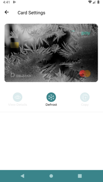
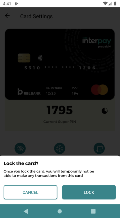
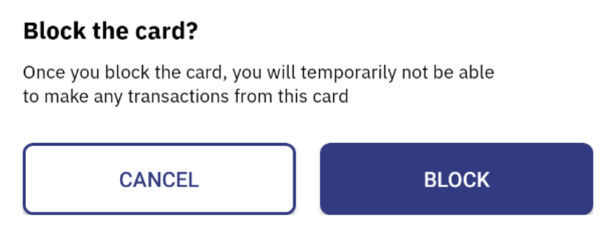
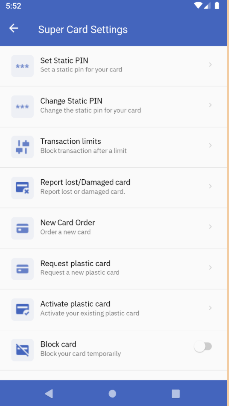
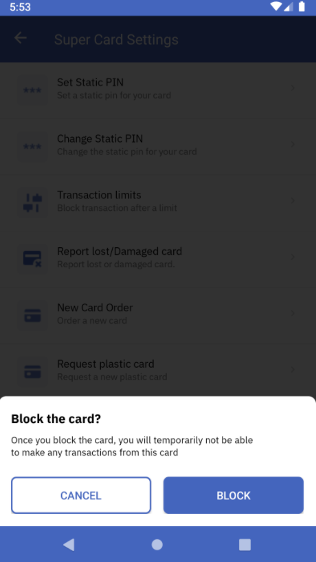
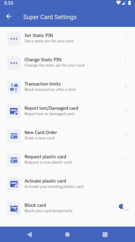
Code Copied Block Card UI
A customized user interface can be created for the blocking card functionality. This UI adds a translucent black background on the existing screen and shows a snackbar containing the option to either Cancel or Block the card.
The following code snippet will allow you to integrate this blocking UI:
Switch Theme
Expand More
Copy
|
|
Code Copied Sample response
Block Card API
This API is used to block the card temporarily. The blocked cards via this API can be reactivated later.
Switch Theme
Expand More
Copy
|
|
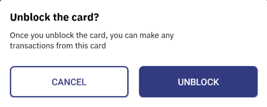
Code Copied Unblock Card UI
The following code snippet will allow you to design a user interface for unblocking the card. The UI adds a translucent black background on the existing screen and shows a snackbar containing the option to either Cancel or Unblock the card.
The following code snippet will allow you to add the unblock card UI into your project:
Switch Theme
Expand More
Copy
|
|
Code Copied Sample response
Unblock Card API
After a user has blocked a card, this API will allow them to unblock the selected card straight from the app.
Switch Theme
Expand More
Copy
|
|
Code Copied Front Face Card View UI
The front-facing portion of the virtual card can be displayed as a user interface on your iOS app using the Cards SDK. This UI comes as a default with the Fusion SDK and you can do a lot of customizations depending upon your customer base.
The following code snippet lets you make customizations on the front-facing card UI:
Switch Theme
Expand More
Copy
|
|
Code Copied Here are some of the UI designs supported with Front Face Card UI:
Design 1
Design 2