

What is Power Center?
Power Center is an analytics dashboard that provides advanced insights on products, businesses, and customers. It provides trends across key metrics that can be used to make appropriate and timely business decisions. It also equips the user with the flexibility to slice data across multiple dimensions (provided in the form of filter criteria) such as - date range, product type, etc. All this with the added advantage of intelligent visualisation techniques to make insight gathering easier.
Following are the default set of aspects that are quantified via appropriate metrics and displayed in the Power Center:
- Activation
- Account Holders
- Accounts
- Payment Instruments
- Engagement
- Payments
- Program Funding
- Daily Engagement
- Retention
- Account Holders
- Revenue
- Program Revenue
The objective of this document is to serve as a user guide for the Power Center tool. Each of the above-mentioned aspects and associated metrics is covered in detail in the following sections.
Activation
Account Holders
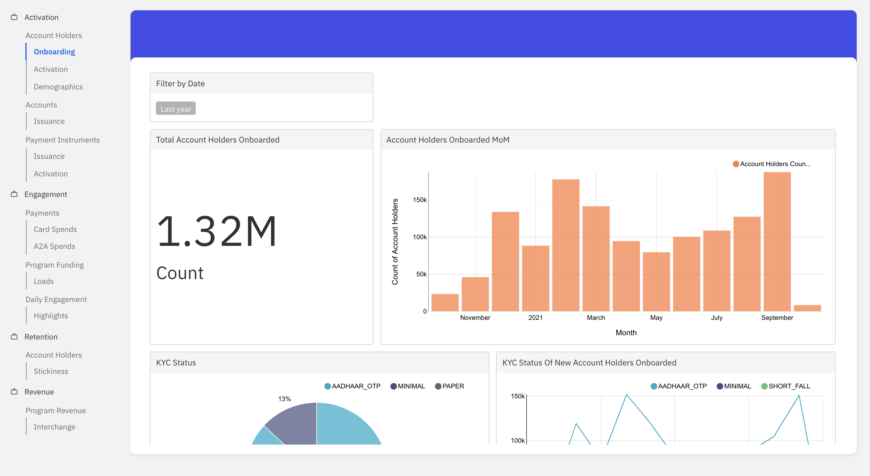
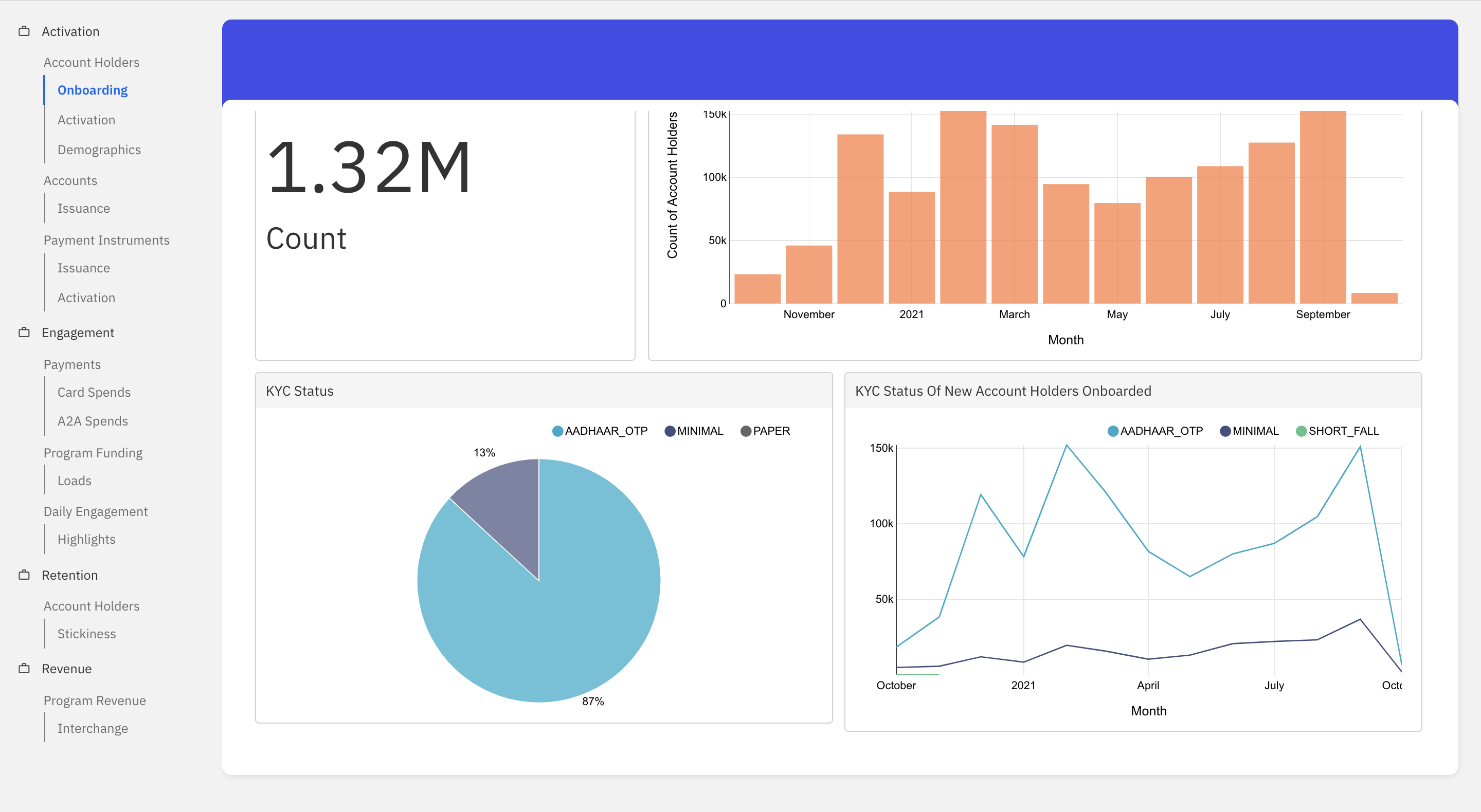
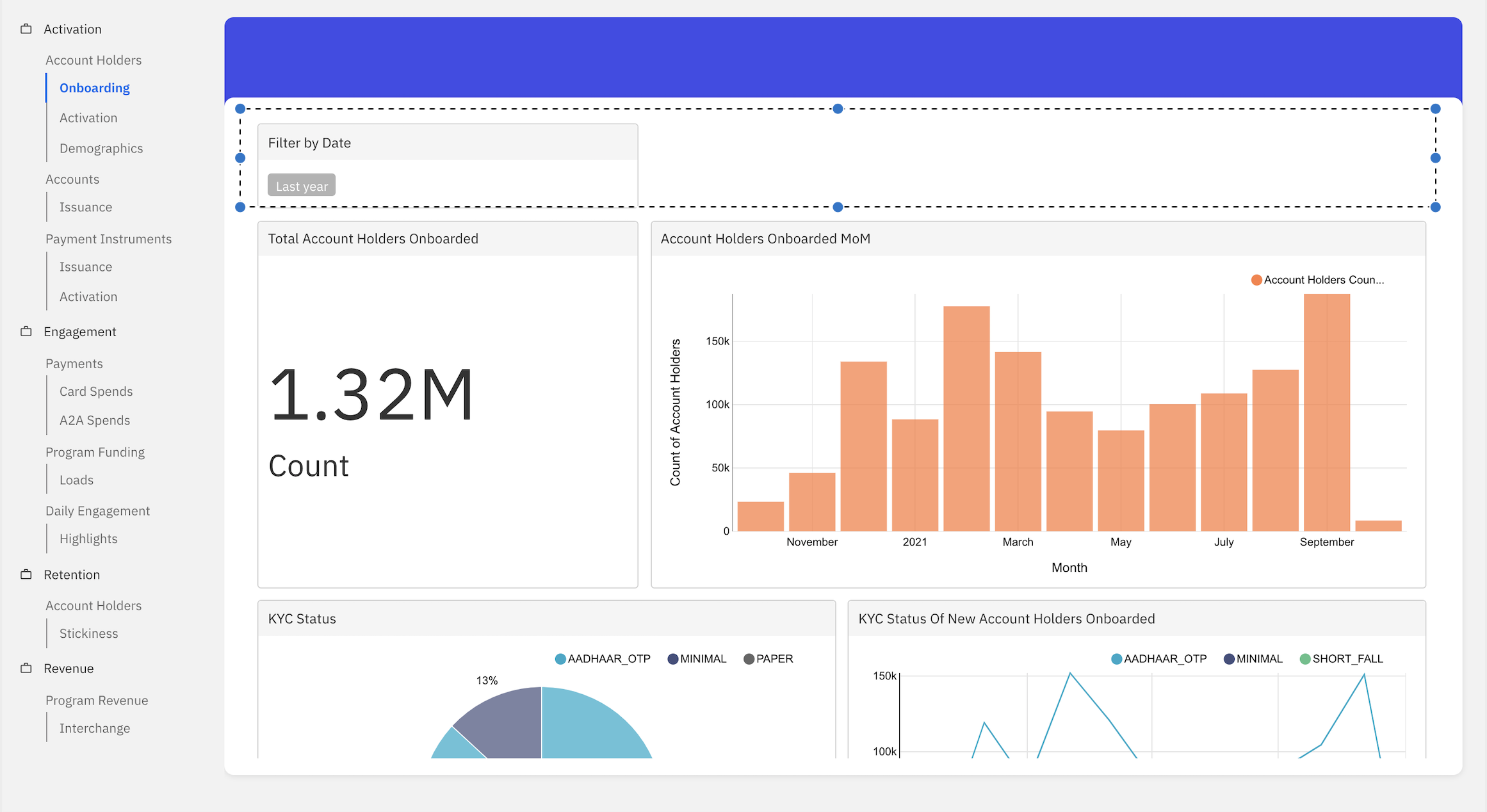
Onboarding
This dashboard helps visualise the onboarding trend of account holders for a given time period. An account holder is considered as onboarded when he/she completes the sign up in the fintech’s app (either min KYC or Full KYC).
- Total Account Holders Onboarded: Refers to the total count of accounts holders onboarded in the given time period.
- Account Holders Onboarded MoM: This graph shows the account holders onboarding trend for the given time period.
- KYC Status: This graph categorizes the account holders onboarded based on the current KYC status for the given time period.
- KYC Status Of New Account Holders Onboarded: This graph shows the KYC status of account holders at the time of onboarding for the given time period.
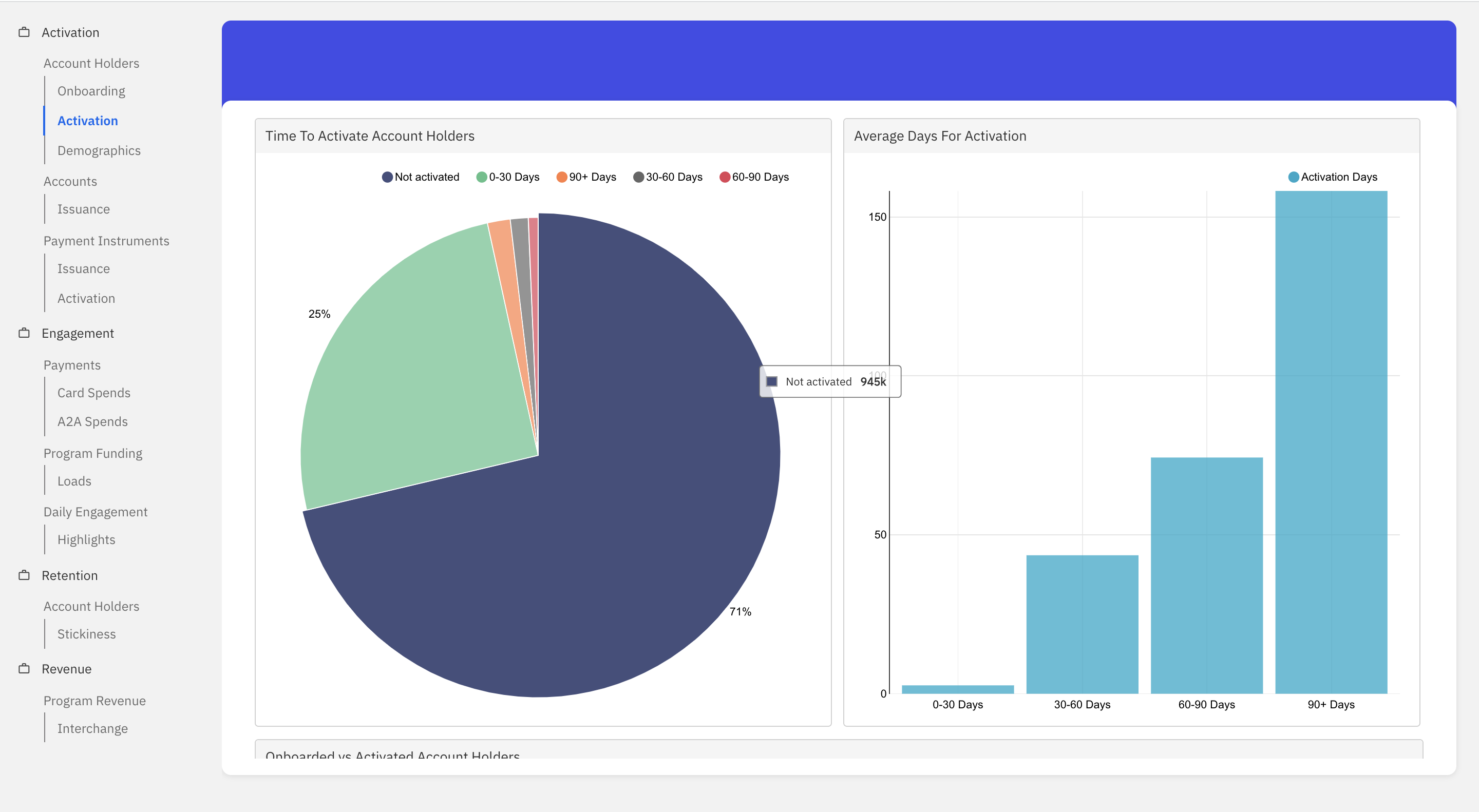
Activation
This dashboard helps visualise the activation trend of account holders for a given time period. An account holder is considered activated when he/she does the first transaction (i.e. 1st credit to the account holder’s ledger).
- Time To Activate Account Holders: This graph categorizes the onboarded account holders based on the time taken for activation. The different time periods considered are 0-30, 30-60, 60-90, 90+ days and not activated.
- Average Days For Activation: This graph shows the average time taken for activation within the 0-30, 25-35 and 30-60, 60-90, 90+ days category.
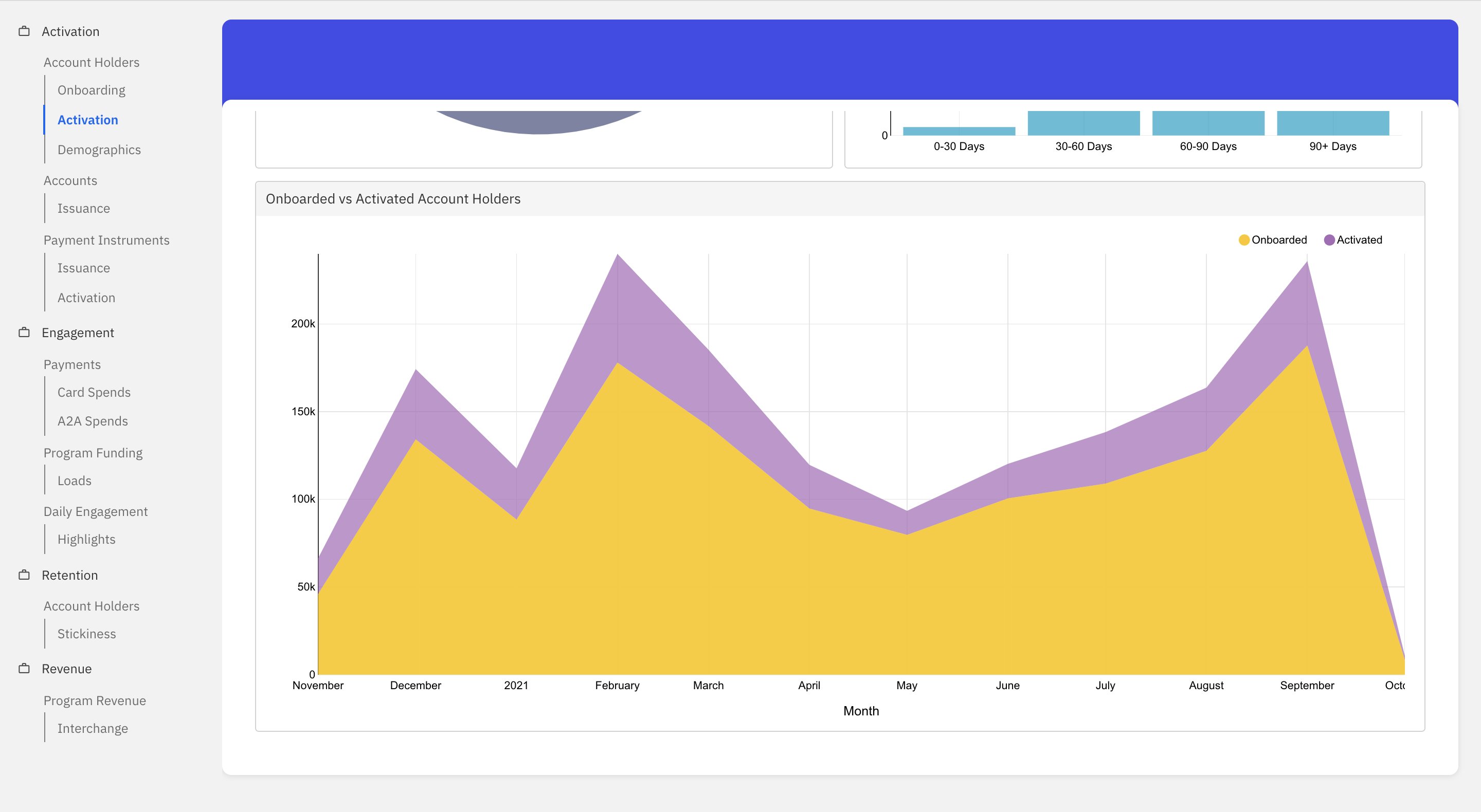
- Onboarded vs Activated Account Holders: This graph shows the onboarding vs activation trend for the given time period.
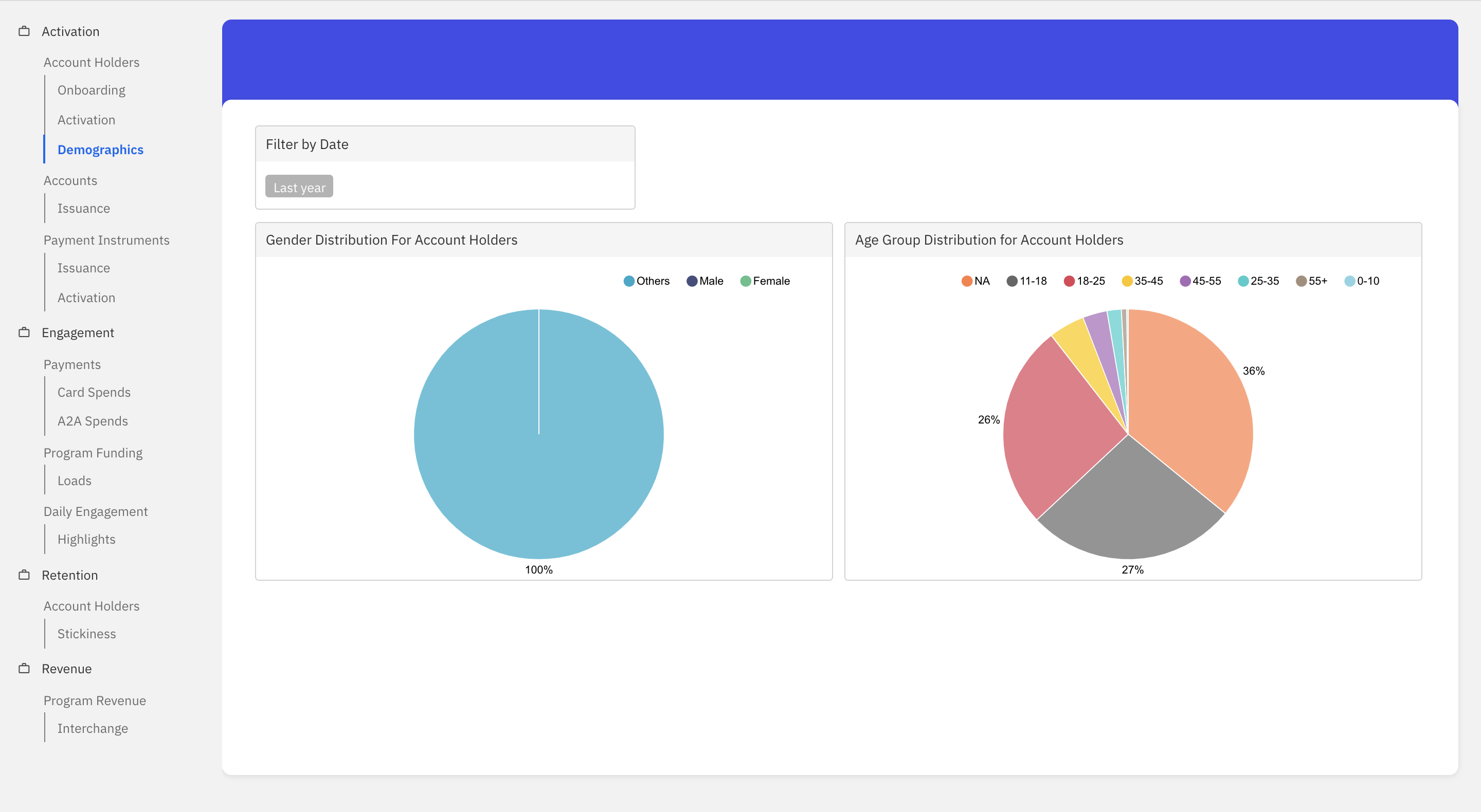
Demographics
This dashboard helps visualise account holders categorised by demographics for a given time period.
- Gender Distribution For Account Holders: This graph categorizes the account holders based on gender in the given time period.
- Age Group Distribution For Account Holders: This graph categorizes the account holders based on the age group in the given time period. The different age groups are 0-10, 11-18, 18-25, 25-35 and 35-45, 45-55, and 55+.
Accounts
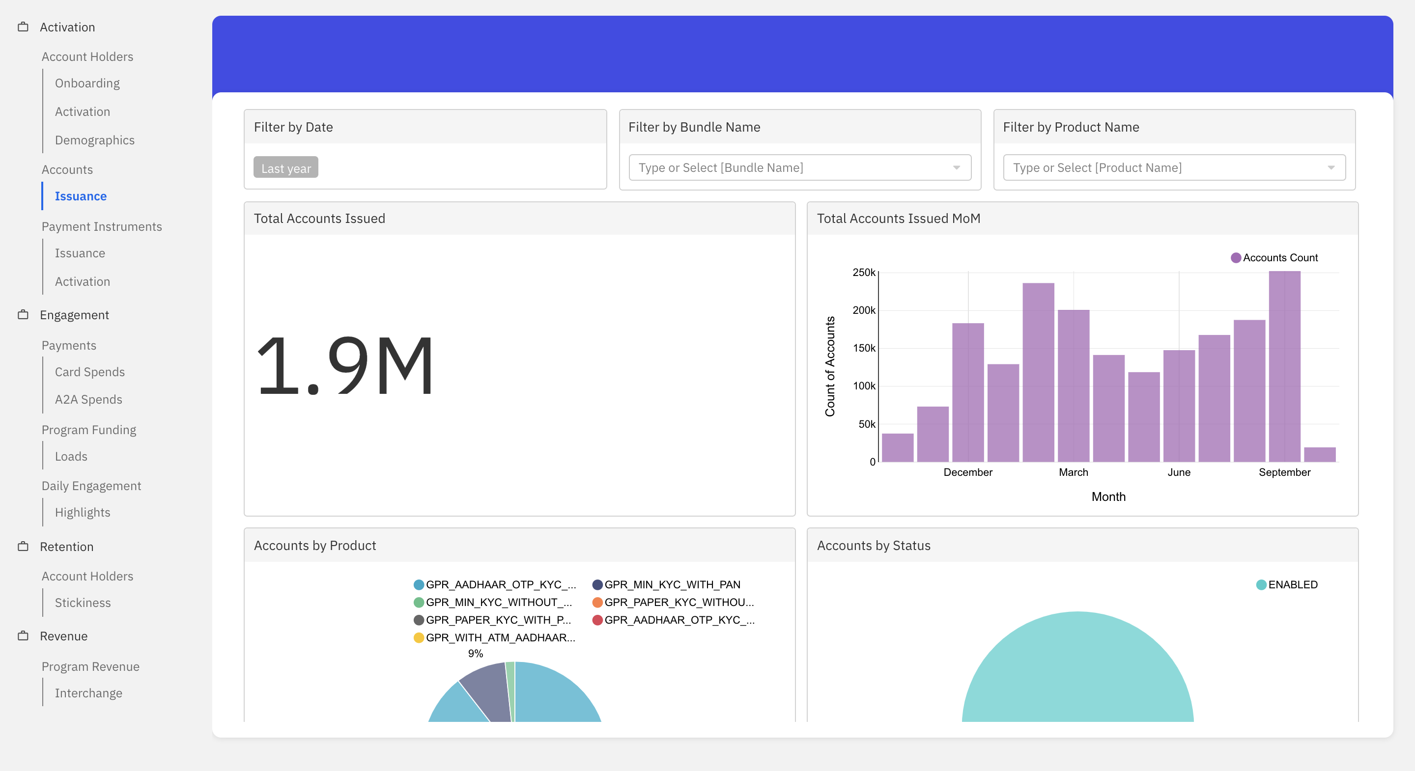
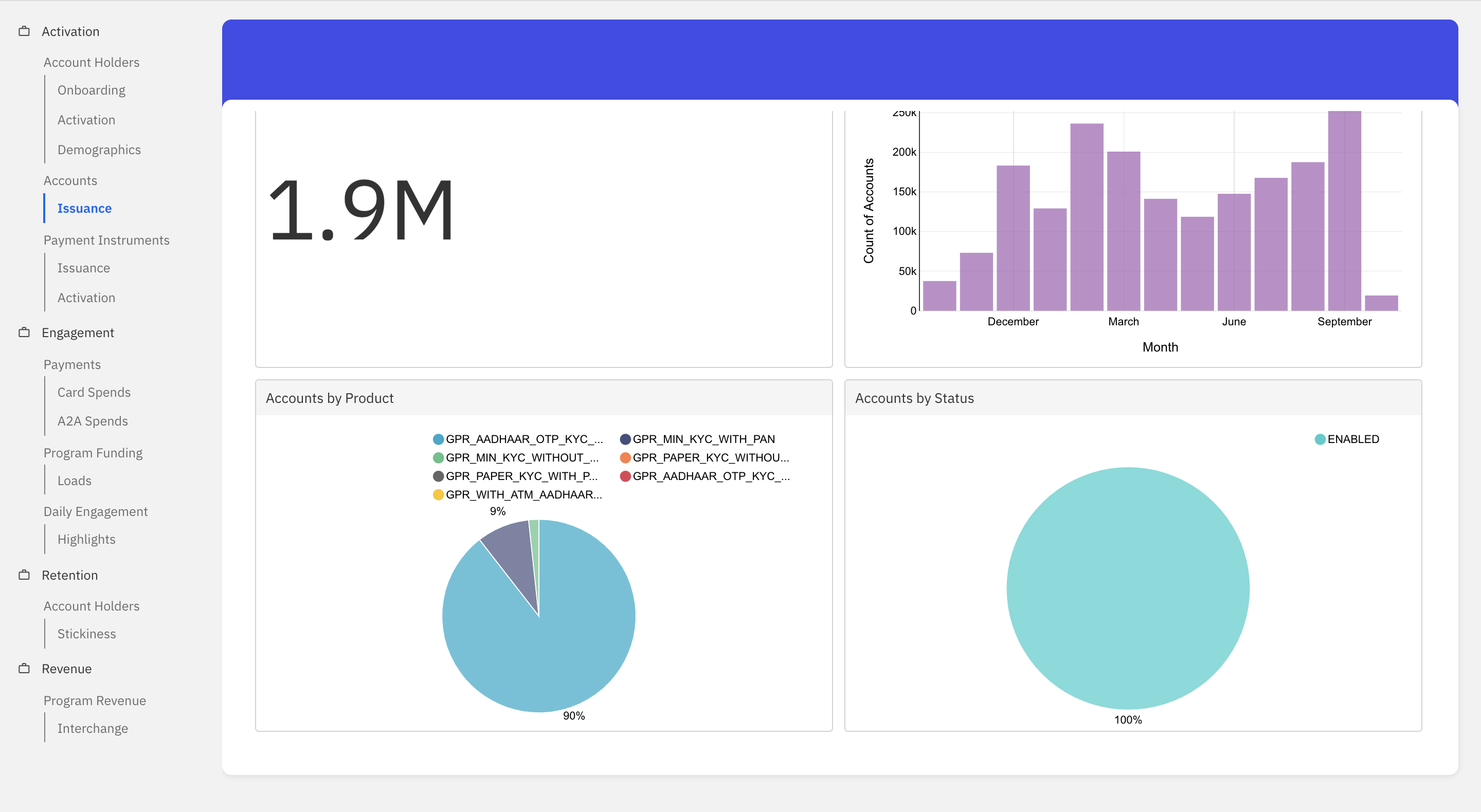
Issuance
This dashboard helps visualise accounts issuance trend for a given time period.
- Total Accounts Issued: Refers to the total count of accounts created in the given time period.
- Total Accounts Issued MoM: This graph shows the new accounts issuance trend for the given time period.
- Accounts By Product: This graph categorizes the accounts issued based on the product in the given time period. The different products considered are:
- GPR_MIN_KYC_WITH_PAN
- GPR_MIN_KYC_WITHOUT_PAN
- GPR_PAPER_KYC_WITH_PAN
- GPR_PAPER_KYC_WITHOUT_PAN
- GPR_AADHAAR_BIOMETRIC_KYC_WITH_PAN
- GPR_AADHAAR_BIOMETRIC_KYC_WITHOUT_PAN
- GPR_AADHAAR_XML_KYC_WITH_PAN
- GPR_AADHAAR_XML_KYC_WITHOUT_PAN
- Accounts By Status: This graph categorizes the accounts issued based on the status for the given time period. The different types of status considered are enabled, debits_disabled, closed, blocked, and credits_disabled.
Payment Instruments
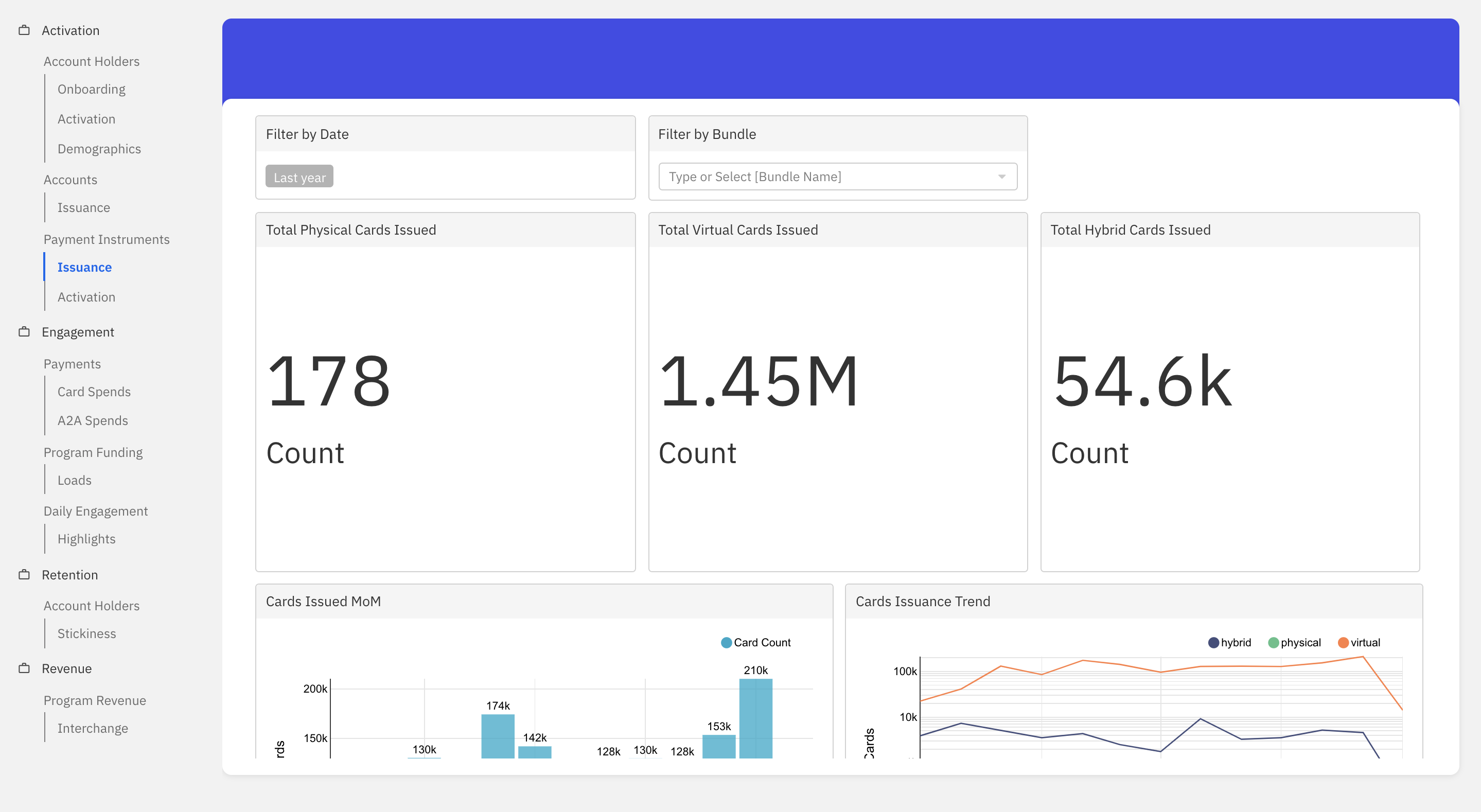
Issuance
Payment instruments are used by the account holders to make financial transactions. This dashboard helps visualise the payment instruments issuance trend for a given time period.
- Total Physical Cards Issued: Refers to the total count of physical payment instruments (physical cards) created and issued to the account holders for a given time period.
- Total Virtual Cards Issued: Refers to the total count of virtual payment instruments (virtual cards) created and issued to the account holders for a given time period.
- Total Hybrid Cards Issued: Refers to the total count of hybrid payment instruments (hybrid cards) created and issued to the account holders for a given time period.
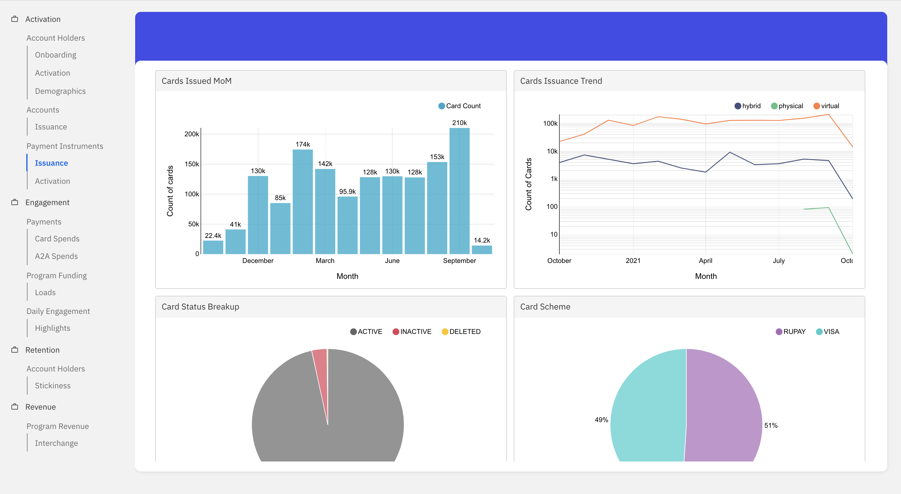
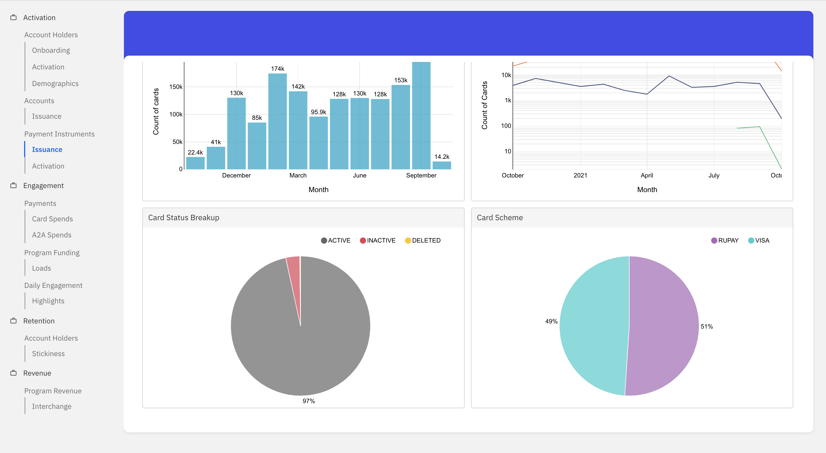
- Cards Issued MoM: This graph shows the count of payment instruments (cards) issued to the account holders in the given time period.
- Cards Issuance Trend: This graph shows the issuance trend across physical vs virtual vs hybrid cards for the given time period.
- Cards Status Breakup: This graph categorizes the cards issued based on the status for the given time period. The different types of status considered are active, inactive and deleted.
- Cards Scheme: This graph categorizes the cards issued based on the card network for the given time period. The card networks considered are Mastercard, VISA and Rupay.
Activation
This dashboard helps visualise the activation trend of payment instruments for a given time period. The payment instrument is considered activated when the first transaction (credit or debit) is completed using the card.
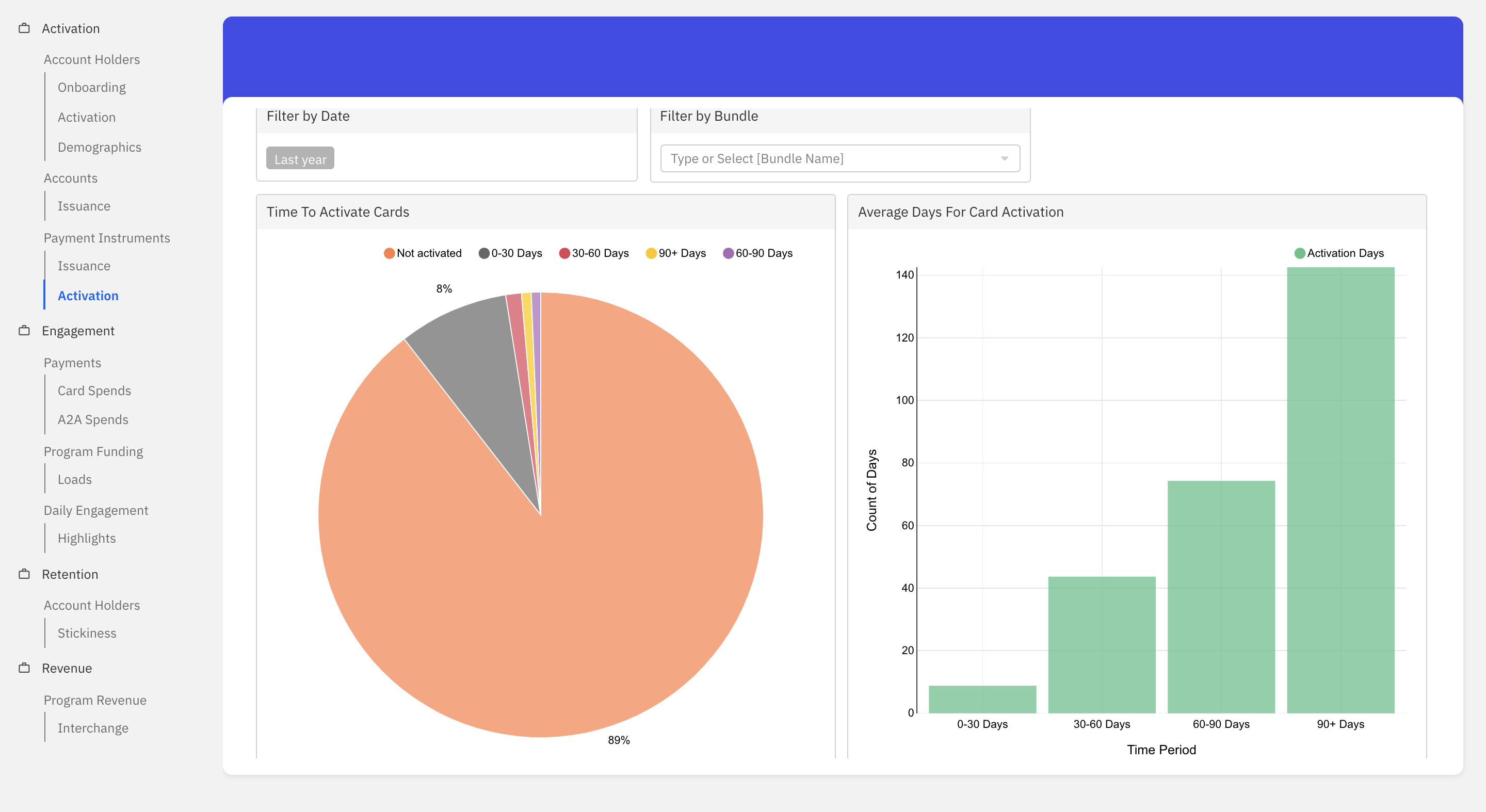
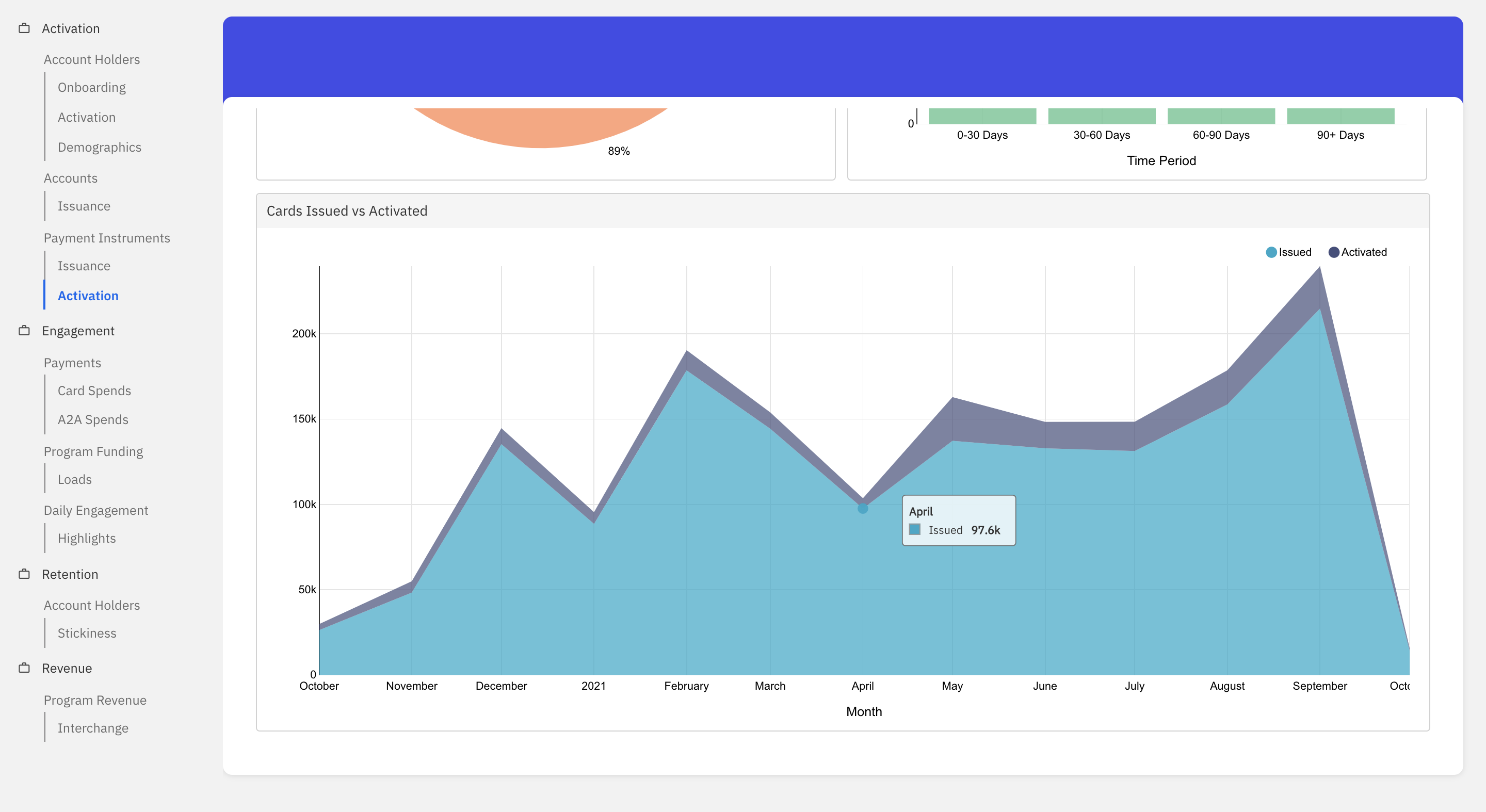
- Time To Activate Cards: This graph categorizes the cards issued based on the time taken for activation. The different time periods considered are 0-30, 30-60, 60-90, 90+ days and not activated.
- Average Days For Card Activation: This graph shows the average time taken for card activation within the 0-30, 25-35 and 30-60, 60-90, 90+ days category.
- Cards issued vs Activated: This graph shows the card issuance vs activation trend for the given time period.
Engagement
Payments
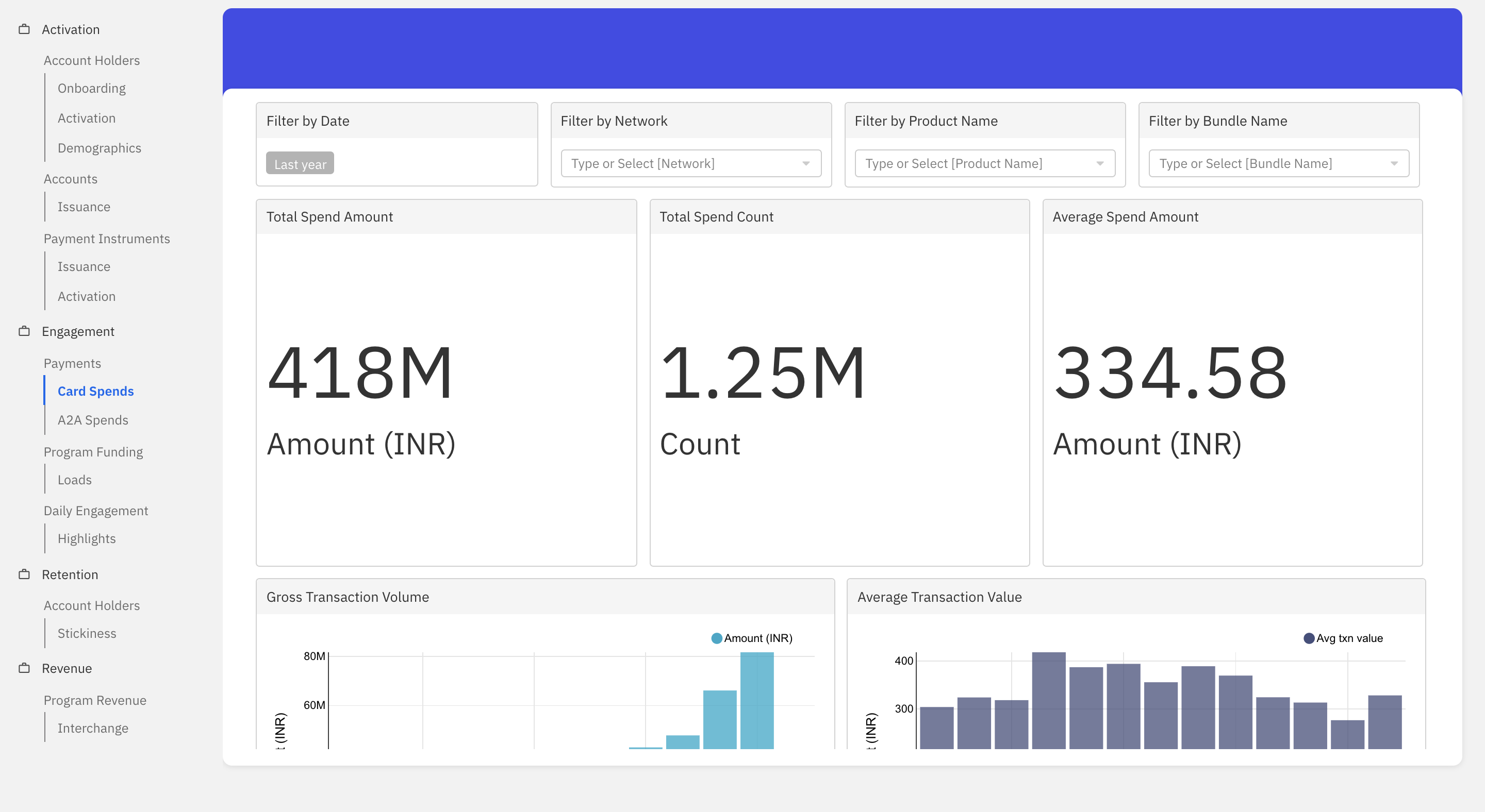
Card Spends
This dashboard helps visualise the spending trend of account holders using the payment instruments (cards) for a given time period.
- Total Spend Amount: Refers to the total amount debited from the system using the payment instruments in the given time period.
- Total Spend Count: Refers to the total debit transactions made using the payment instruments in the given time period.
- Average Spend Amount: Refers to the average amount spent by account holders using payment instruments in the given time period.
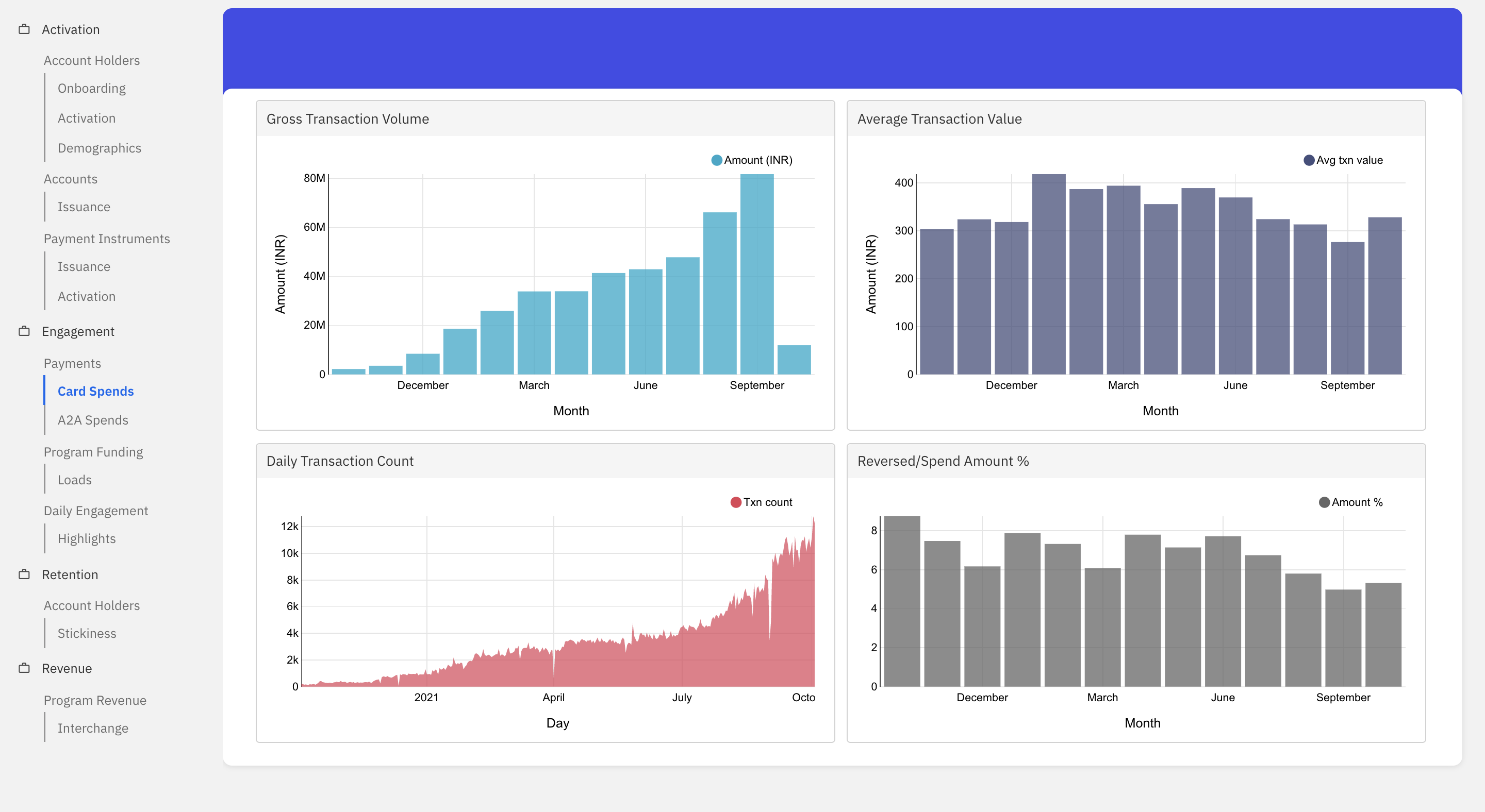
- Gross Transaction Volume: This graph shows the spending trend of the account holders in terms of gross transaction volume for the given time period.
- Average Transaction Value: This graph shows the spending trend of the account holders in terms of the average transaction value for the given time period.
- Daily Transaction Count: This graph shows the transaction count on a daily basis for the given time period.
- Reversed/Spend Amount %: This graph shows the total reversal amount as a percentage of the total spend amount for the given time period.
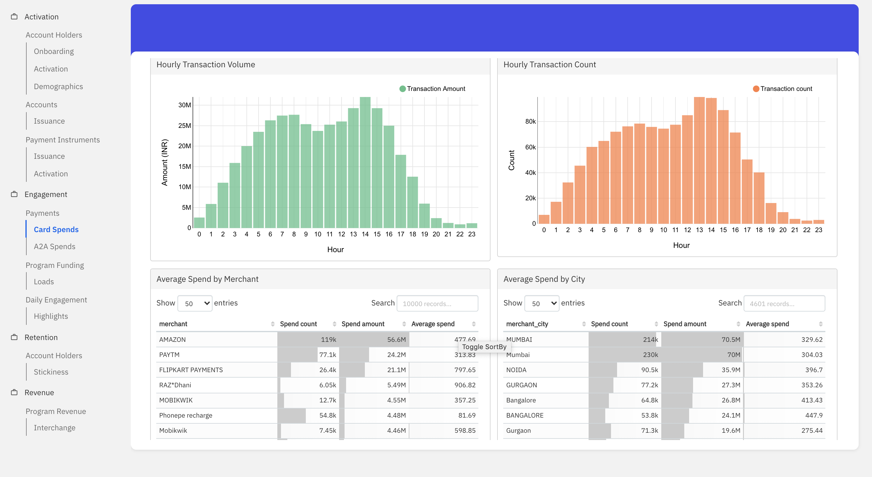
- Hourly Transaction Volume: This graph shows the total amount spent using payment instruments across different hours of the day for the given time period.
- Hourly Transaction Count: This graph shows the total spends using payment instruments across different hours of the day for the given time period.
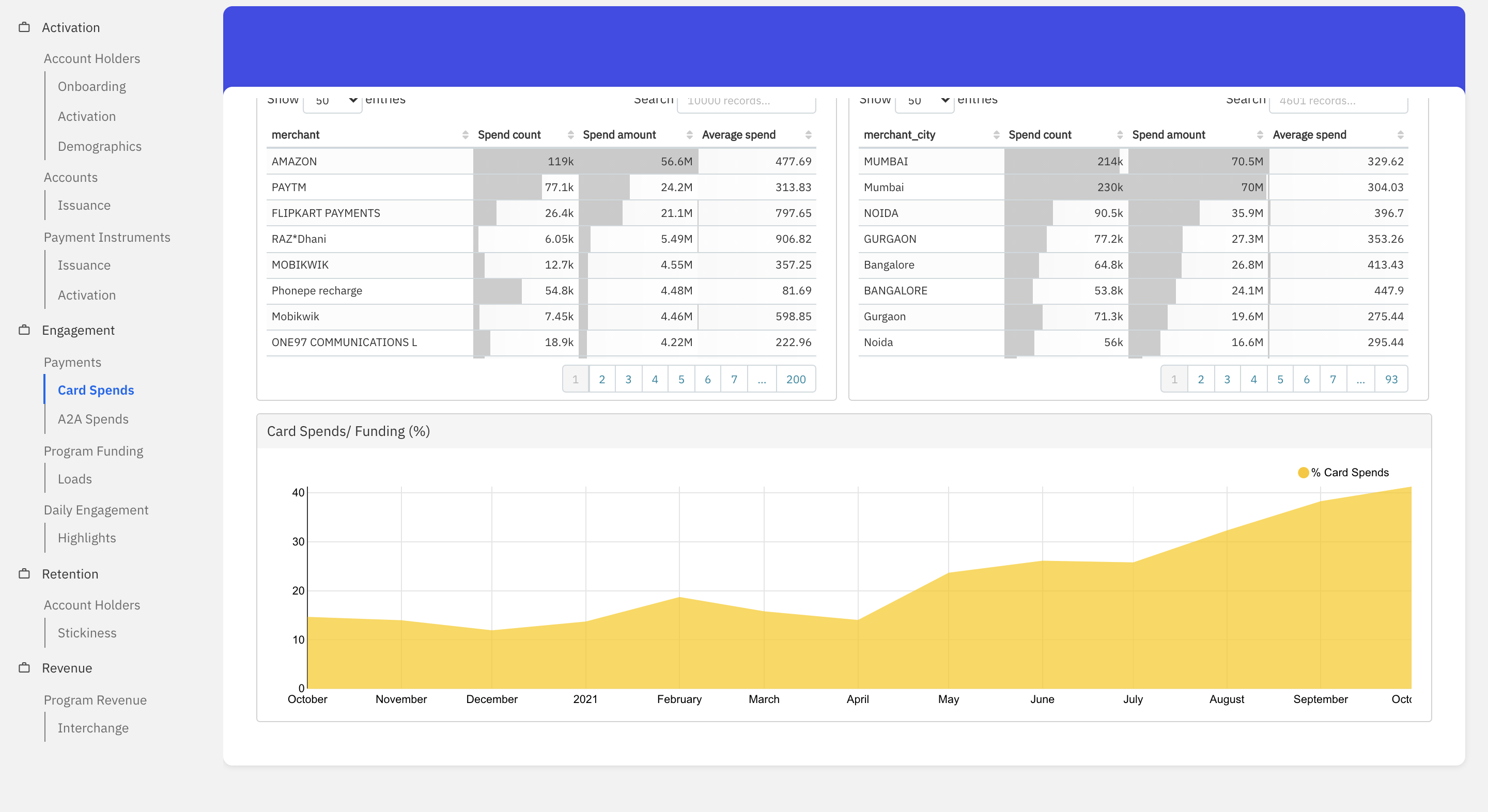
- Average Spend by Merchant: This table shows the total volume, total amount and the average spend made by a consumer categorised as per the merchant’s name, for a given period of time.
- Average Spend by City: This table shows the total volume, total amount and average spend made by a consumer categorised as per merchant’s city, for a given period of time.
- Card Spends/ Funding (%): This graph shows the card spends as a percentage of the total funding amount for the given time period.
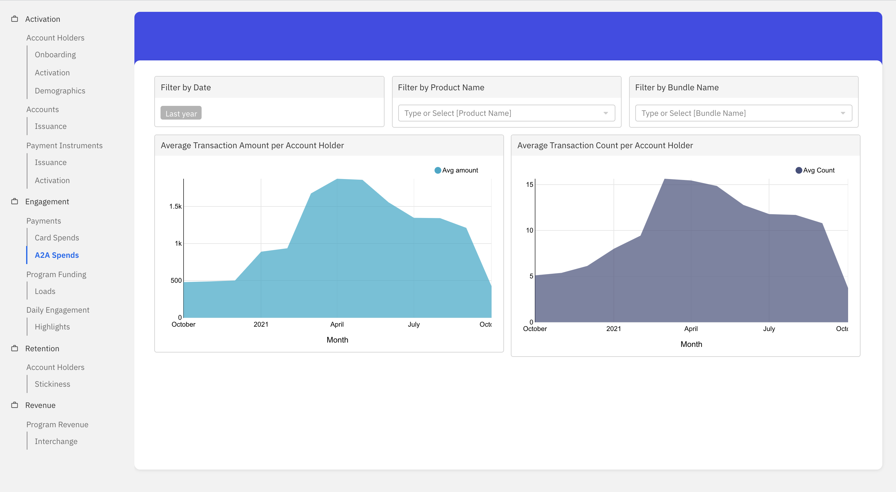
A2A Spends
This dashboard helps visualise the account to account transfer trends for a given time period.
- Average Transaction Amount per Account Holder: Refers to the average amount of account to account transfers done by the account holders in the given time period. i.e. the sum of A2A amounts divided by the total count of account holders.
- Average Transaction Count per Account Holder: Refers to the average count of account to account transfers done by the account holders in the given time period. i.e. count of A2A transactions divided by the total count of account holders.
Program Funding
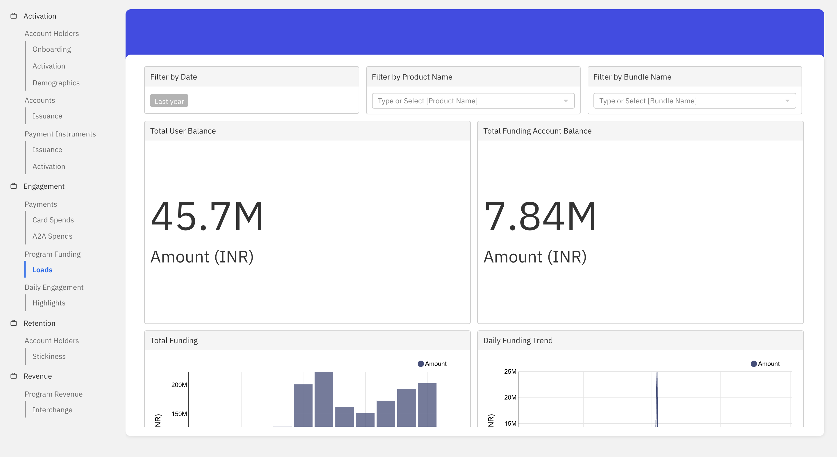
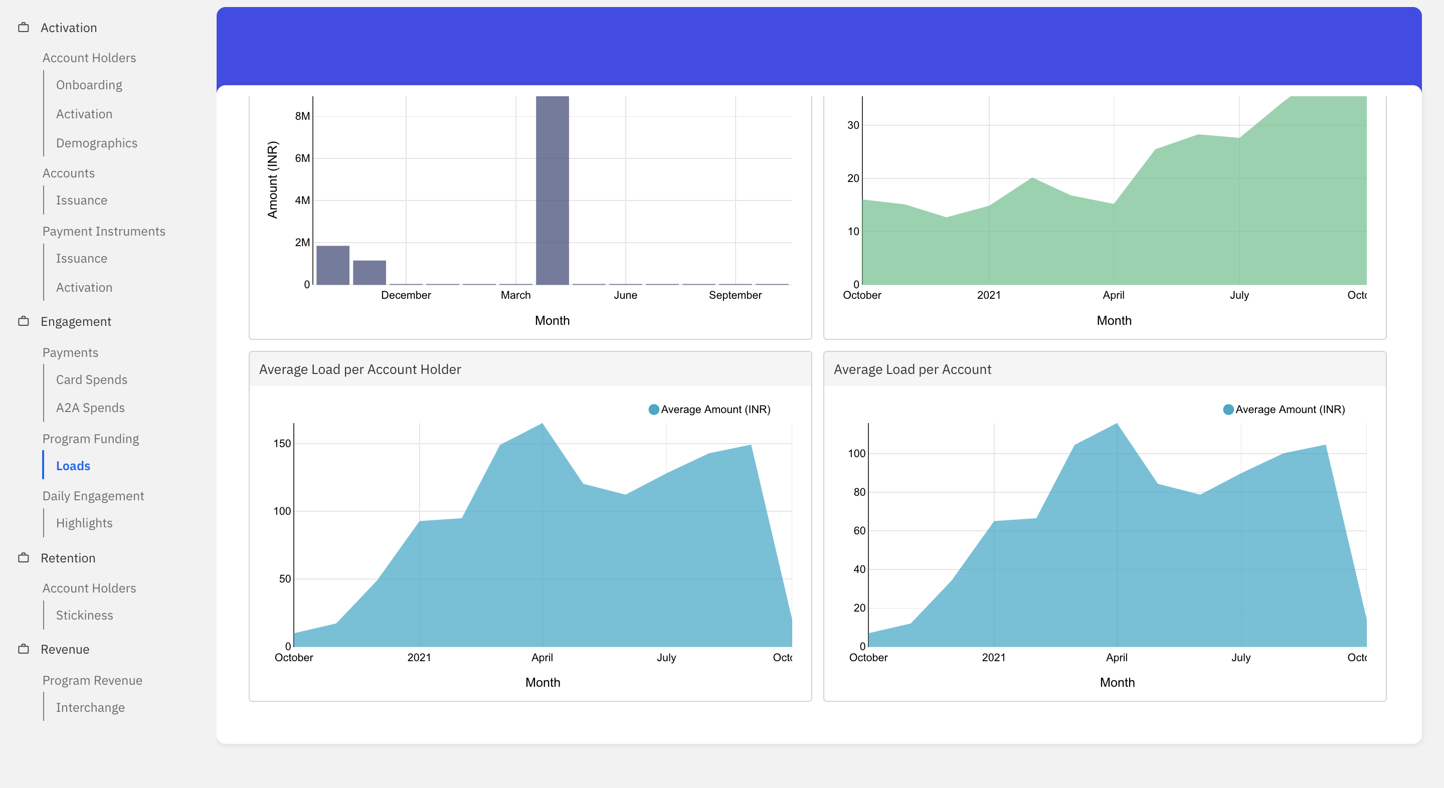
Loads
This dashboard helps visualise the funding trend for a given time period.
- Total User Balance: Refers to the total amount of funds in the account holders’ account as of T-1.
- Total Funding Account Balance: Refers to the total amount of funds in the funding account of the fintech as of T-1.
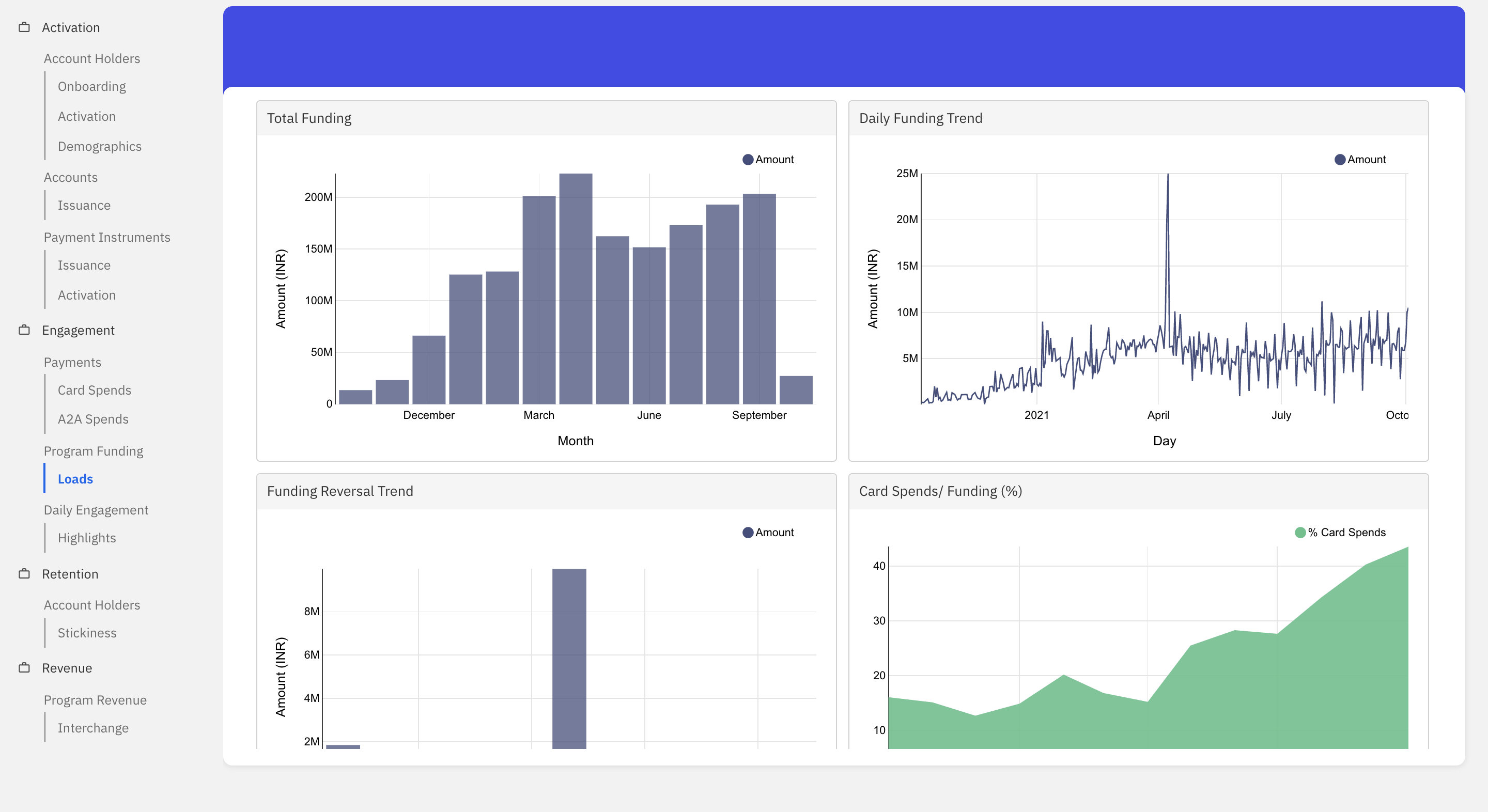
- Total Funding: This graph shows the monthly trend of funding by the fintech for the given time period.
- Daily Funding Trend: This graph shows the daily trend of funding by the fintech for the given time period.
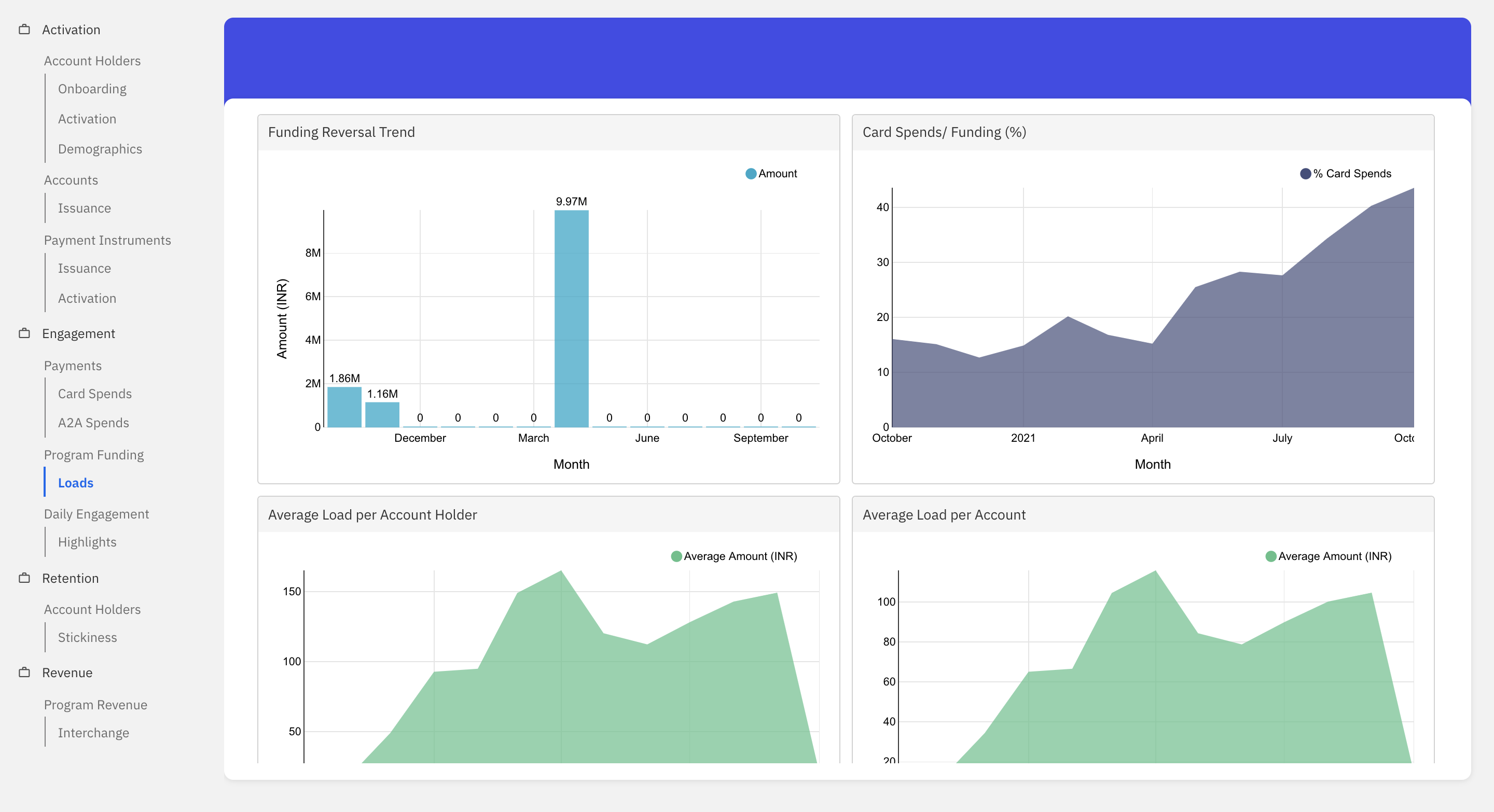
- Funding Reversal Trend: This graph shows the total amount of funds that is reversed from the funding account for the given time period.
- Card Spends/ Funding (%): This graph shows the card spends as a percentage of funding for the given time period.
- Average Load per Account Holder: This graph shows the average load per account holder, i.e Total funding divided by the number of distinct account holders for the fintech.
- Average Load per Account: This graph shows the average load per account, i.e Total funding divided by the number of distinct accounts for the fintech.
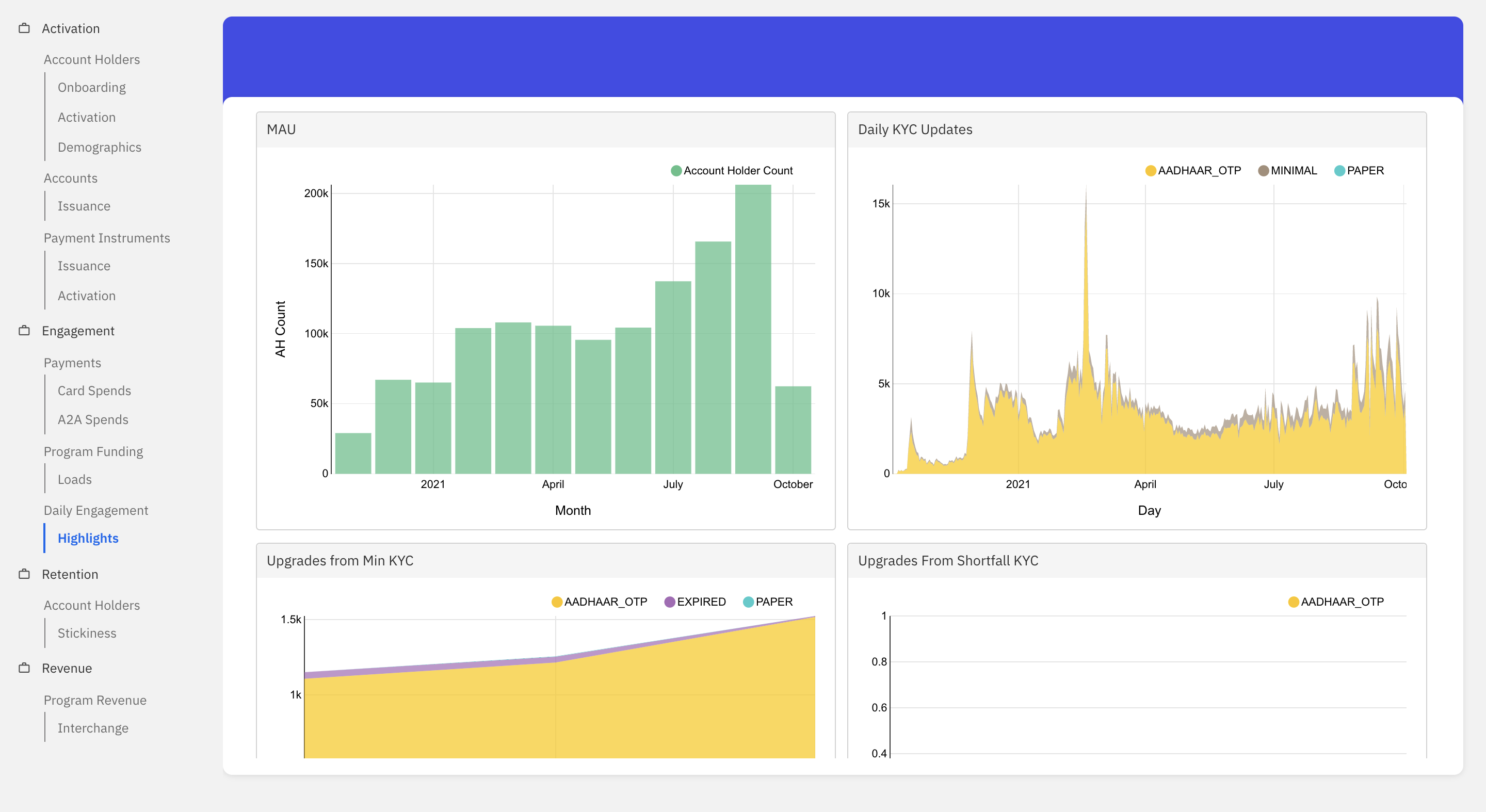
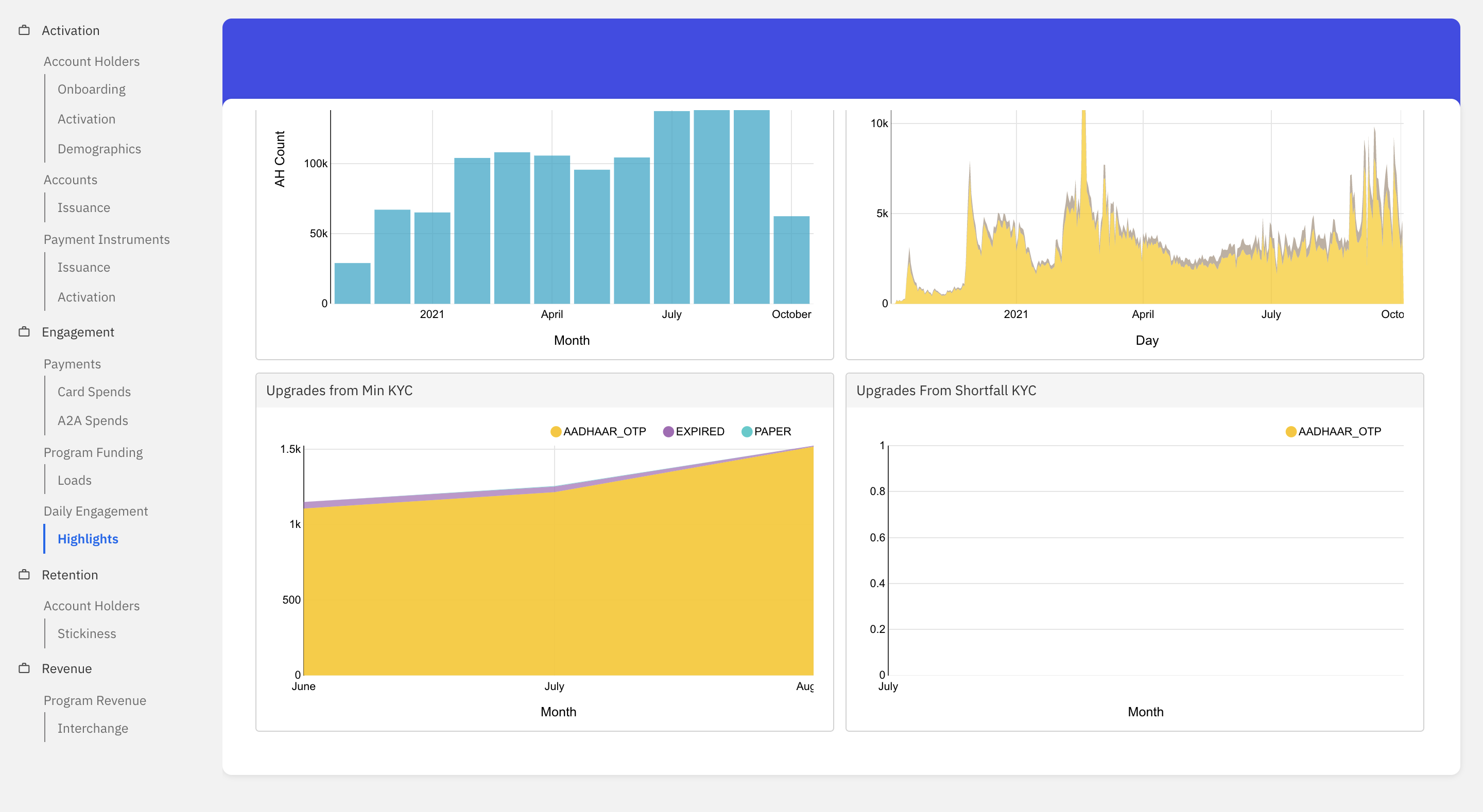
Daily Engagement
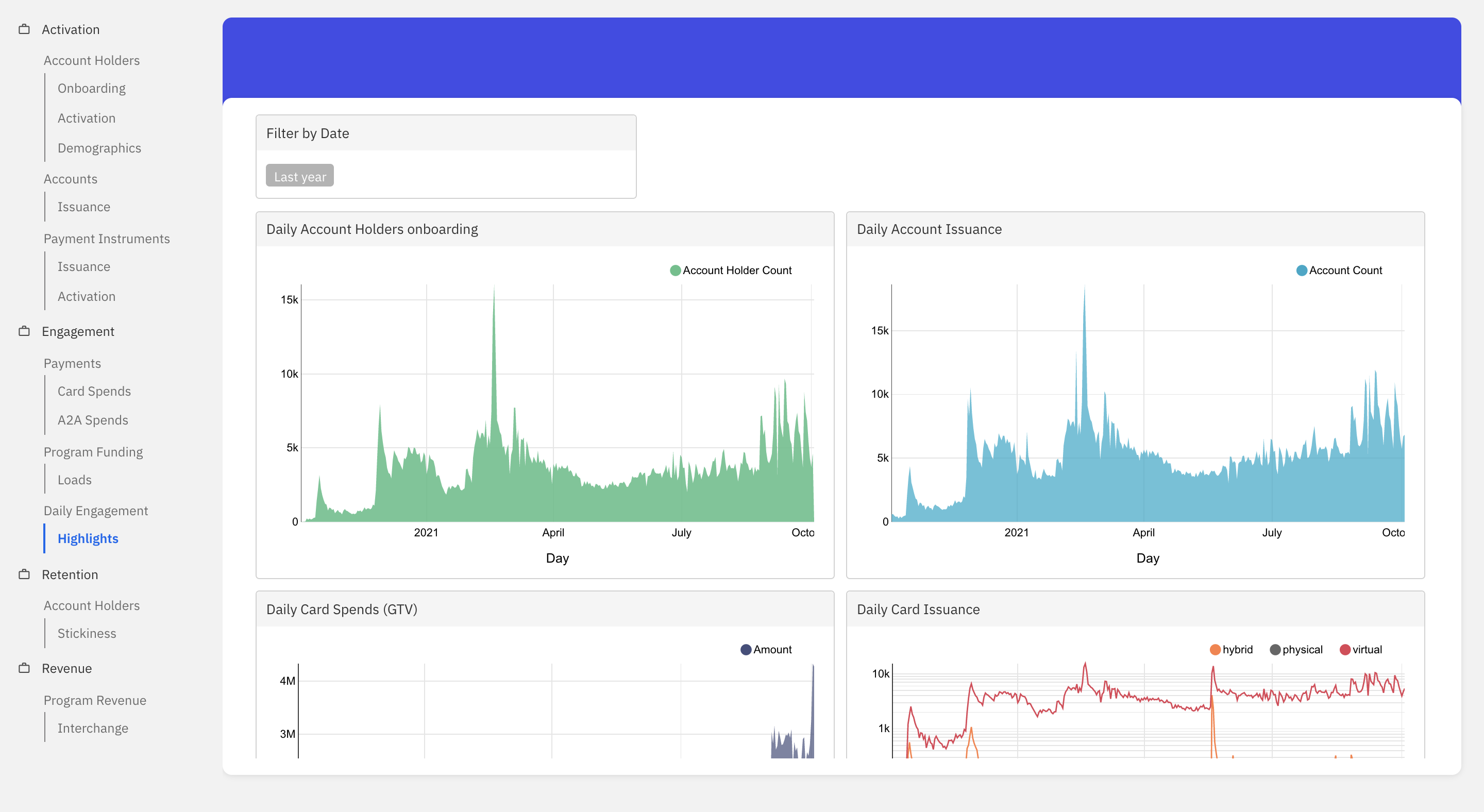
Highlights
This dashboard helps visualise the daily trend across different aspects for a given time period.
- Daily Account Holders Onboarding: This graph shows the total number of account holders onboarded on a daily basis for the given time period.
- Daily Account Issuance: This graph shows the total number of accounts issued on a daily basis for the given time period.
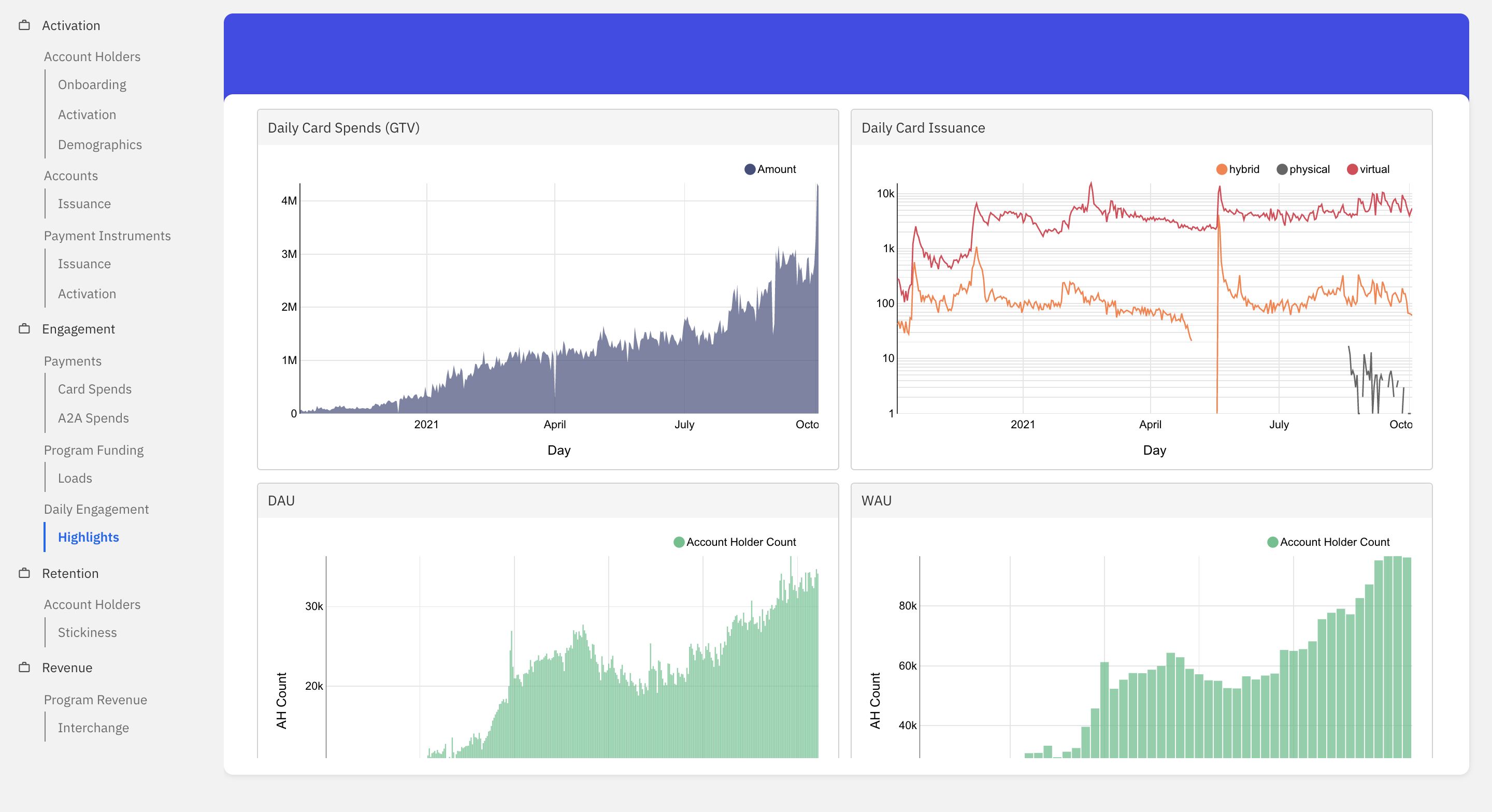
- Daily Card Spends (GTV): This graph shows the total card spends on a daily basis for the given time period.
- Daily Card Issuance: This graph shows the total number of cards issued on a daily basis across hybrid, physical and virtual for the given time period.
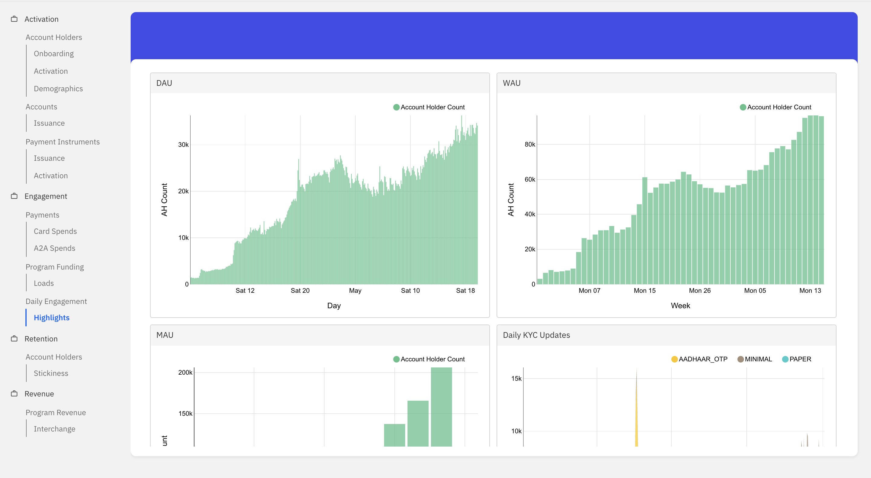
- DAU: Number of users who have been subject to either credit or debit transaction on the given day.
- WAU: Number of users who have been subject to either credit or debit transaction in a week.
- MAU: Number of users who have been subject to either credit or debit transactions in a month.
- Daily KYC Updates: This graph shows the total number of KYC updates on a daily basis for the given time period.
- Upgrades from Min KYC: This graph shows the total number of updates from Minimal to Full or Expired KYC status for the given time period.
- Upgrades from Shortfall KYC: This graph shows the total number of updates from Shortfall to Minimal, Full or Expired KYC status for the given time period.
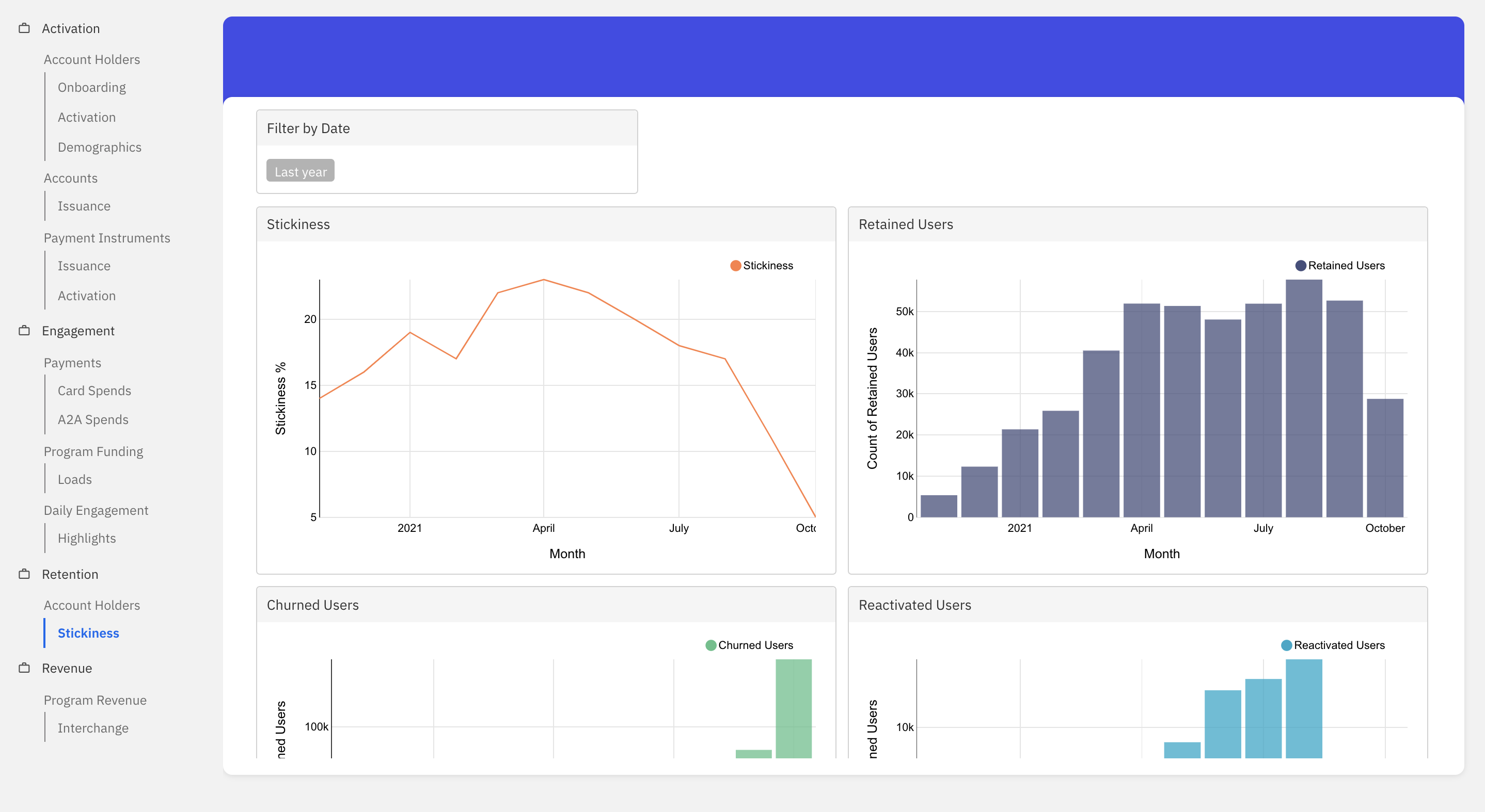
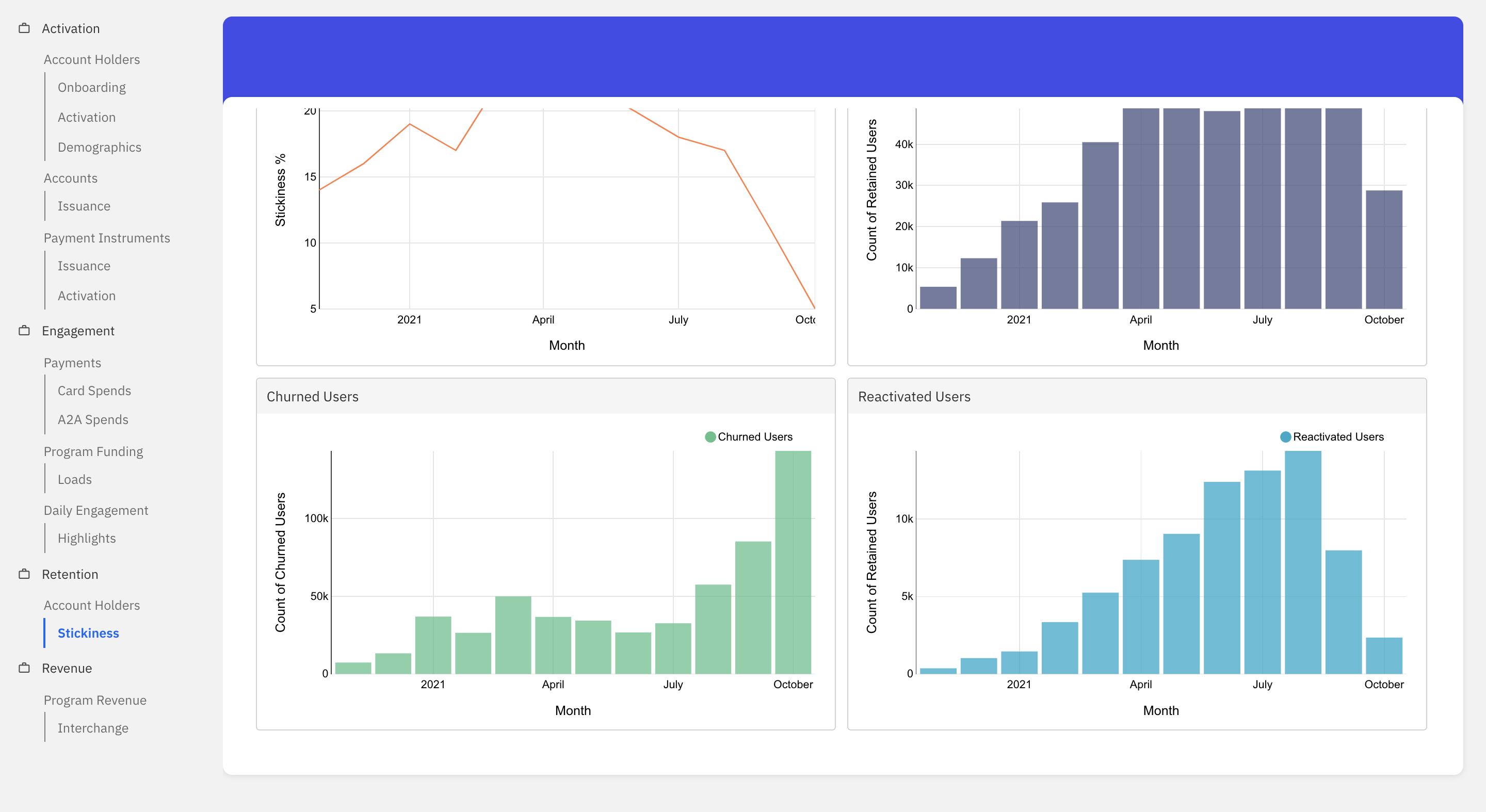
Retention
Account Holders
Stickiness
This dashboard helps visualise the stickiness trend for a given time period.
- Stickiness: This graph shows the stickiness trend of the account holders for the given time period. The stickiness metric refers to the number of monthly active customers who transact in a single-day window, i.e Average DAU/MAU.
- Retained Users: This graph shows the total number of account holders who received funding in the last two months consecutively.
- Churned Users: This graph shows the count of account holders who received funding in the previous month but not in the present month for the given time period.
- Reactivated Users: This graph shows the count of account holders who received funding in the current month but not in the previous month.
Revenue
Program Revenue
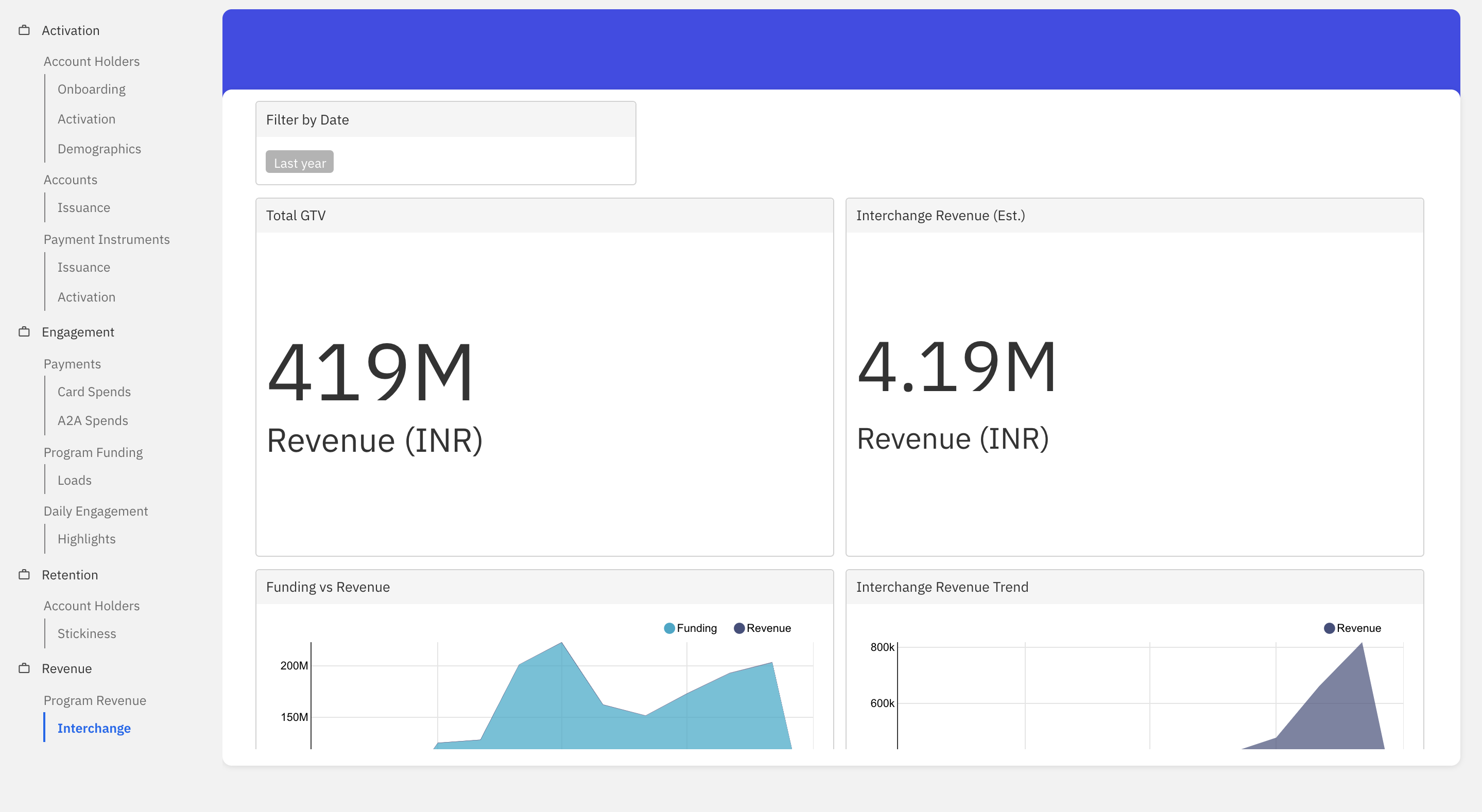
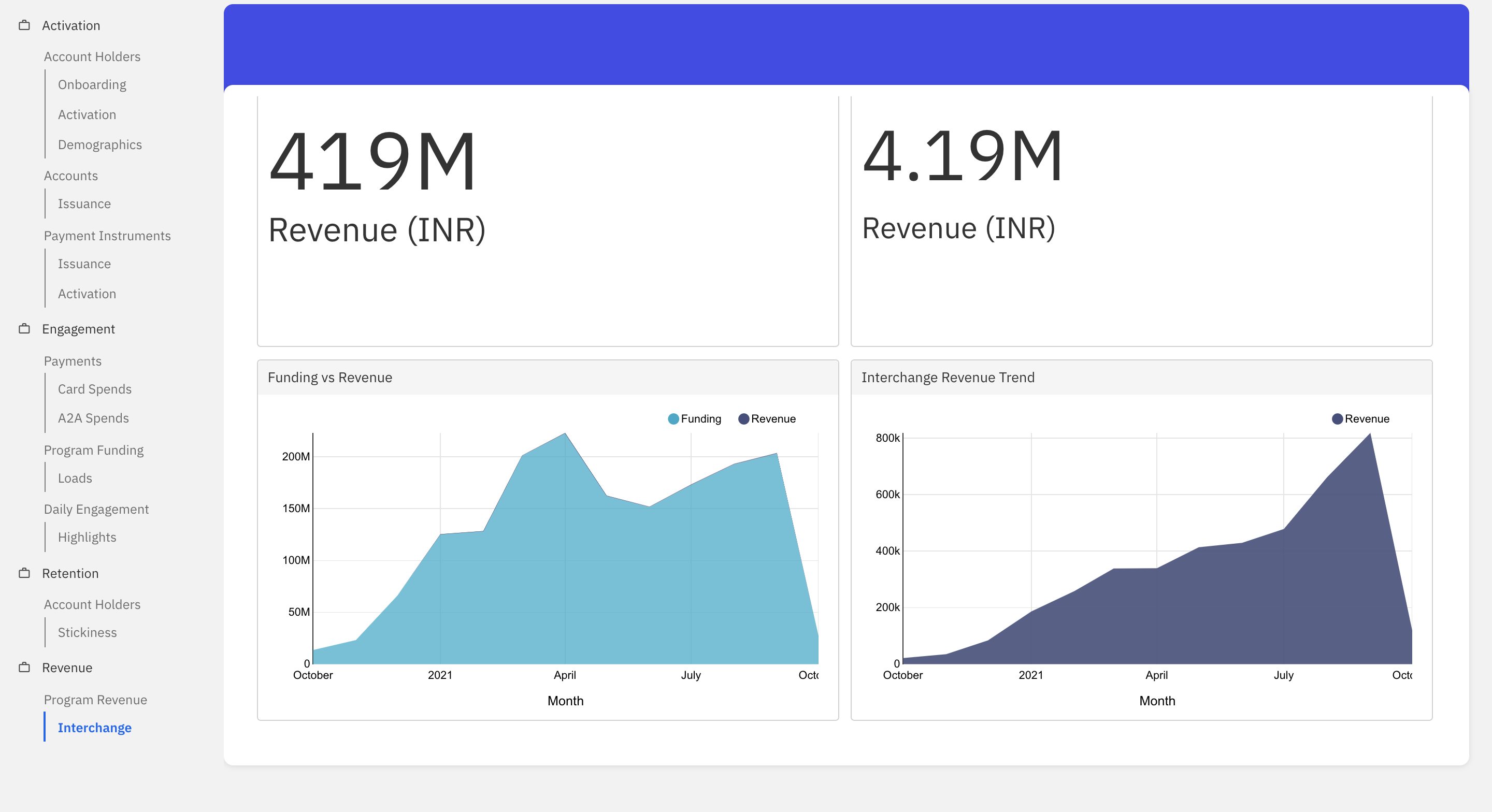
Interchange
This dashboard helps visualise the interchange revenue trends of the fintech for a given time period. The following voucher codes are considered for calculating the revenue - ECOM|POS.
- Total GTV: Refers to the total amount of card transaction volume processed in the given time period.
- Interchange Revenue (Est.): Refers to the total revenue earned by Fintech for a given time period. i.e. Estimate of Interchange revenue at 1% of GTV. Funding vs Revenue: This graph shows the funding vs revenue trend for the fintech in the given time period.
- Interchange Revenue Trend: This graph shows the interchange revenue trend for the given time period.
Filters
Filters help in dissecting data across various dimensions. Filters also help in focussing along one dimension or making a graph more readable. In Power Center, there are two types of filters:
- Dashboard level filters: These are the filters that are presented as dropdowns on each dashboard. A user can choose appropriate values in each of these dropdowns. A combination of all the chosen values is considered to render graphs with appropriate data. It is to be noted that all the graphs present in the particular dashboard will only be effected with the select filter criteria. Filter criteria selected on one dashboard has no effect on the graphs displayed on another dashboard. These filters can be used to focus on a dimension such as product type, city, channel type, etc.
- Graph level filters: These are the filters that are presented as legends in each graph. A user can toggle-click on each of these legend values in order to hide or unhide a given line/bar representation from a given graph. These filters can be used to improve readability of the graphs.

Following is the exhaustive list of all dimensions/filters presented as part of dashboard level filters:
- Date: This filter can be used to set a date range for which the graphs of a given dashboard shall be rendered.
- Bundle: The bundle is just a collection of Financial Products. There are 2 types of products that are currently supported by Fusion - Account Products and Payment Products
- Network: This filter specifies the network provider. For example Rupay, Mastercard, and VISA.
- Product: A product is a commercial packaging of artifacts of a specific type to be provisioned by a Fintech. Artifacts come into existence through a product and their behaviour is governed by the product policies. A product works within the confines of a product family and is intended to target a subset of potential customers with an appropriate packaging of features of the artifact for that target group. Example: GPR_MIN_KYC etc.